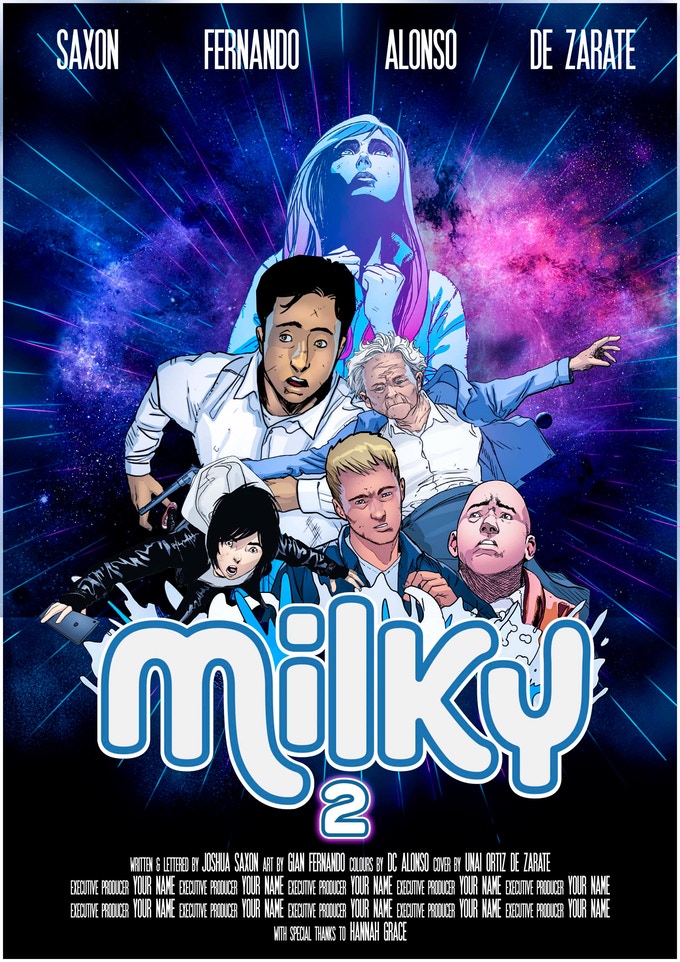
- Milky #2 (of 4)
- Live on Kickstarter (& fully funded)
- Created, Written, & Lettered by Joshua Saxon
- Illustrated by Gian Fernando (on DeviantArt)
- Colors by DC Alonso
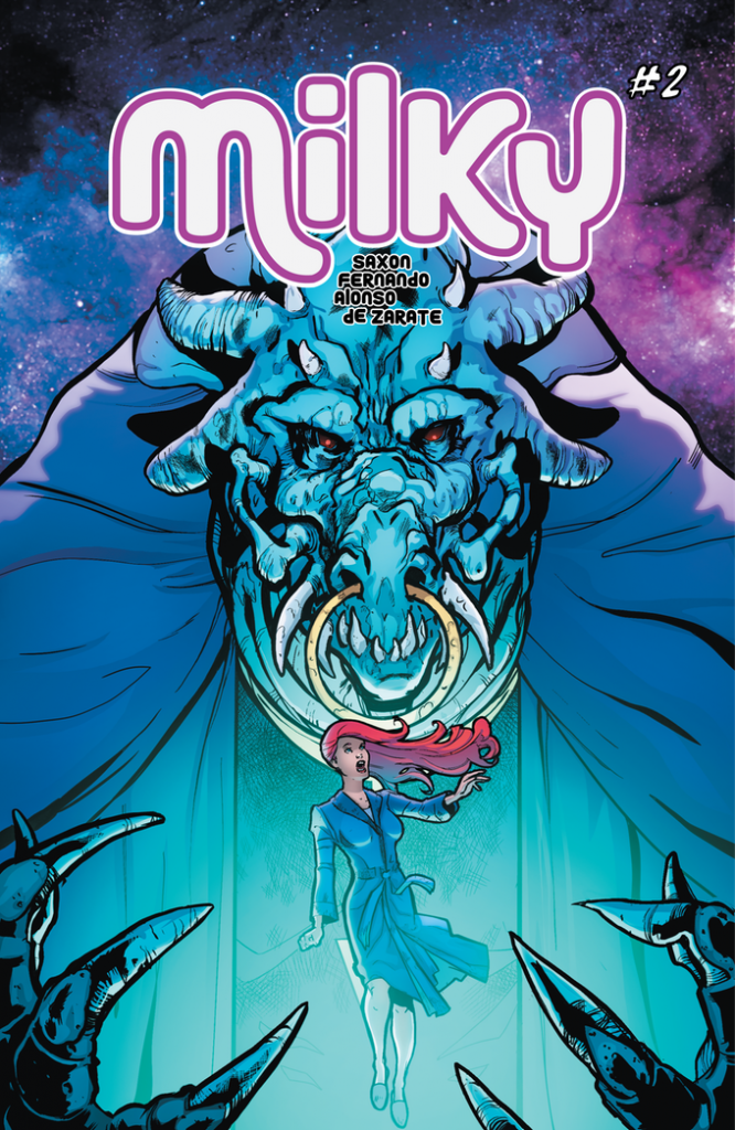
- Cover by Unai Ortiz de Sarate
The aliens have come to Earth, & they’re here for the women!
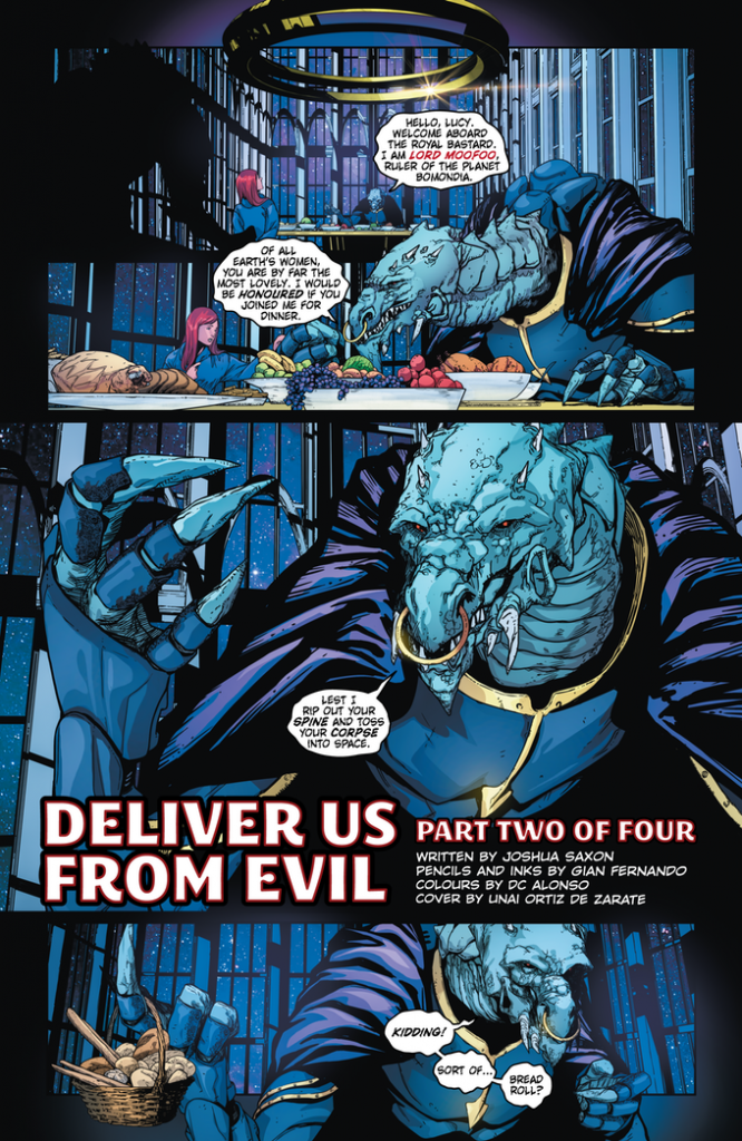
Wow… doesn’t sound very “woke”, does it? Before you turn around and walk out on this one, you might wanna read on a bit farther. Apparently, the denizens of the planet Bomondia are in a bit of a pickle. While the males of the species have been dedicated to producing the strongest, most aggressive, and most virile specimens in the universe, the females have been finding it more difficult to “keep up” with them. As a result, Lord Moofu is leading an expedition to find suitable mates with which to breed. In all of the myriad of galaxies, only human women have been found to be strong enough, courageous enough, possessing the sheer moxie needed to survive a Bomondian pregnancy. Human males, on the other hand, are less than useless and will be easily subjugated by these nigh-invulnerable universal conquerors.
See, it’s only kinda sexist… and joke’s on you, it’s more of a dig on us lowly men. I can take it if you can.
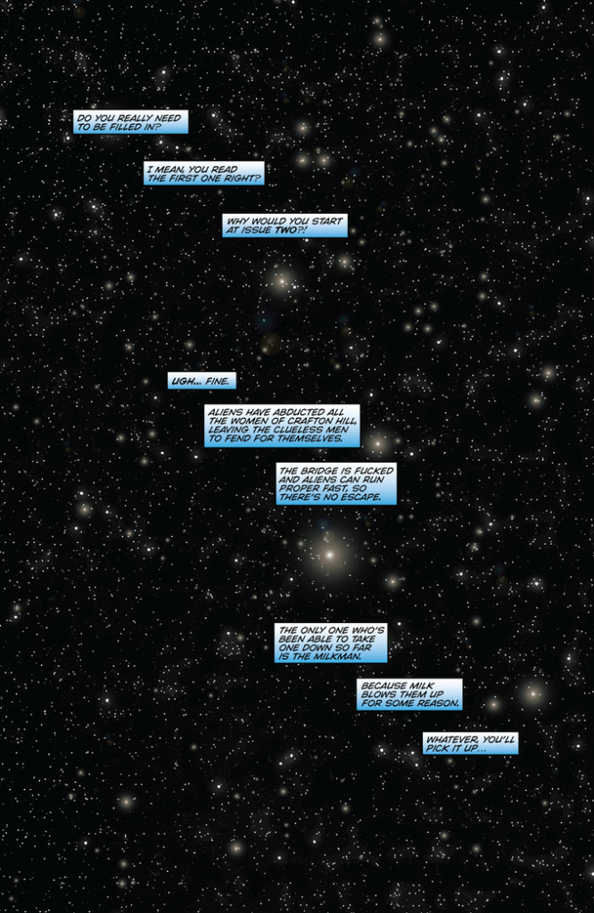
Joshua Saxon is out to break a few tropes, shake up a couple conventions, and maybe even piss some people off. Milky is more farce than anything else, and takes every conceivable step to avoid taking itself even a wee bit seriously. That fact is established on the opening page, laid bare for all to see by the self-aware, Fourth Wall breaking narrator of this sordid tale of romance and abject subjugation who is at first reluctant to give a recap of issue 1. I mean, why would anyone start a comic series at issue 2, right? Who does that?
Hold on, you haven’t read issue 1? Oh for the love of… Okay, look, go here and read my review of issue 1. Then, once you’ve been convinced of how awesome it is, get it, read it, then come back and we’ll talk about it.
Are you back? I can’t tell if you’re back yet.
Whatever, I’m just gonna carry on with the review. You can catch up later.
Joshua Saxon… right. I believe the correct, if culturally appropriating term is “right cheeky bastard”. His writing style is very loose, occasionally offensive, and often hilarious and has a true gift for creating stereotypical characters who are exactly what they appear to be, and taken in as a whole, I’ll be damned if it doesn’t work. Add the sum of the parts together, and what we’ve got here is some damn fine social commentary that’s perfectly content to poke fun at pretty much everything considered sacred and off-limits.
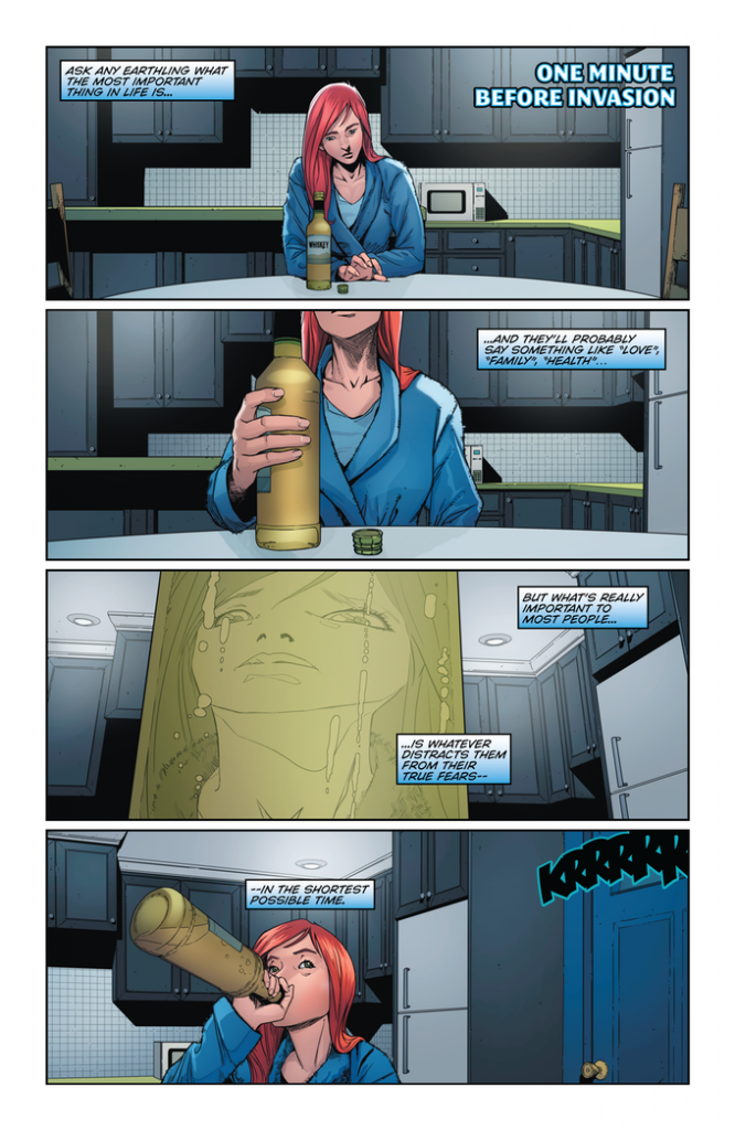
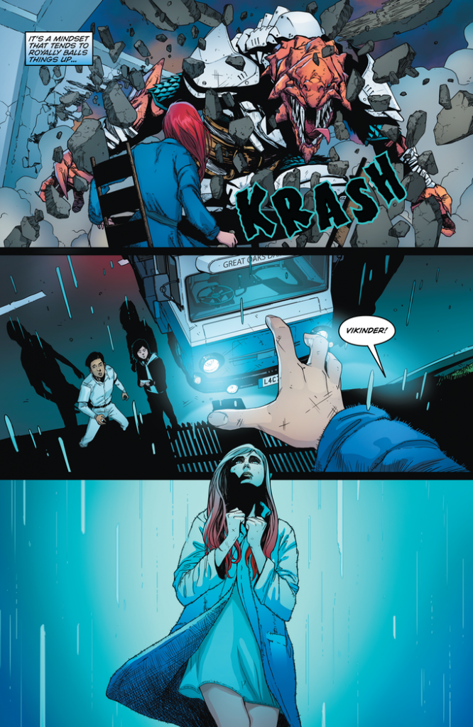
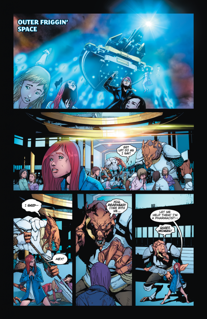
Of course we’re talking about a comicbook, and a comicbook just wouldn’t be any good at all if it didn’t have pictures in it. In that regard, lemme reassure you that Gian Fernando can draw! From his character designs showing the average citizen of Crafton Hill as unique and unassuming individuals, each with their own built in personality, to the armored T-Rex sized Bomondians, Fernando should never be without work in the industry. If I were going to split hairs at all, I might say that there could be a little more emphasis placed on some of the sight gags in the issue- I missed the creative use Ghost finds for his smartphone (hint… ewwww)- and if the aliens reaction to milk were really pushed over the top, I don’t think it’d hurt at all. None of this takes any enjoyment out of reading the comic at all. In fact, when I missed the phone gag, I went back to re-read the issue, and laughed even more the second time around.
With the writing, pencils, & inks holding up against any other title out there, I’m gonna have to pull something really creative out to do justice to the colors and lettering. First, it has to be noted that a colorist can make or break an artist. The best line work can be completely undone if the coloring doesn’t fit. Not only does the work done by DC Alonso fit here, I think it enhances Fernando’s very detail oriented style. Alonso’s work gives everything a very distinct look that makes it easy to pick all the particulars out without getting them jumbled together. It’s bright, it’s cheery… the perfect palette in which to display the End of the World as we know it.
Finally, I’m gonna throw in a big ol’ kudo for letterer, none other than the double duty pulling Joshua Saxon. His lettering adds the emphasis to his script without taking anything away from what’s being said or drawing attention away from Fernando’s outstanding artwork. Saxon uses an easy to read font, something that’s not as big a gimme as you might think, particularly given the effort spent to differentiate the alien speech from the human. Don’t get me wrong, everyone’s speaking English, but he actually manages to give the Bomondians a rough, growly sounding voice…. Except for Lord Moofu. I don’t know how it was done, but Moofu comes across as the smarmiest ponce in the history of smarmy ponces.
I guess I can’t really say it enough. Milky is one of the most unapologetically entertaining titles I’ve had the pleasure of reading since Charlie Chaplin socked Hitler on the nose and an imaginary gorilla kept a former Marine from going off the deep end. With the first issue more than reasonably priced on ComiXology (I got it for free to review, and I still went back to purchase it again), there’s no reason at all not to get in on this tongue in cheek indie title.
Final Score: 10+
