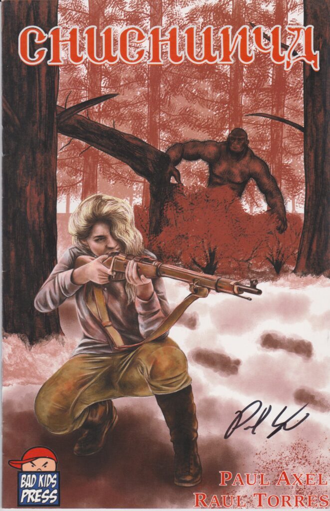
- Chuchunya
- Bad Kids Press
- Written & Lettered by Paul Axel
- Illustrated by Roel Torres
- Cover art by Sam Watson
In April 1928, a Soviet scientist is escorted by a group of soldiers to the Siberian wilderness on an expedition. What they find is terror beyond their imagining…
I got to attend this year’s C2E2 and spent most of my time wandering the always awesome Artist Alley. While I was there, I got to meet up with a few people I’ve chatted with online but never met in person, or folks I haven’t seen in a good long while. One of the new acquaintances I made was Paul Axel, an enthusiastic creator who’s put together a horror comic of which he seemed pretty proud.
Enter the Chuchunya.
Russian folklore talks about the giant hominid, with theories ranging from a Russian sasquatch to a surviving offshoot of Neanderthals living in isolation. Wherever the truth may lie, one thing’s for sure: people do love themselves a cryptid. We like to ponder the whole “what if…” of an entire species that’s been able to slip through the evolutionary cracks while living in whatever remote regions our planet has left.
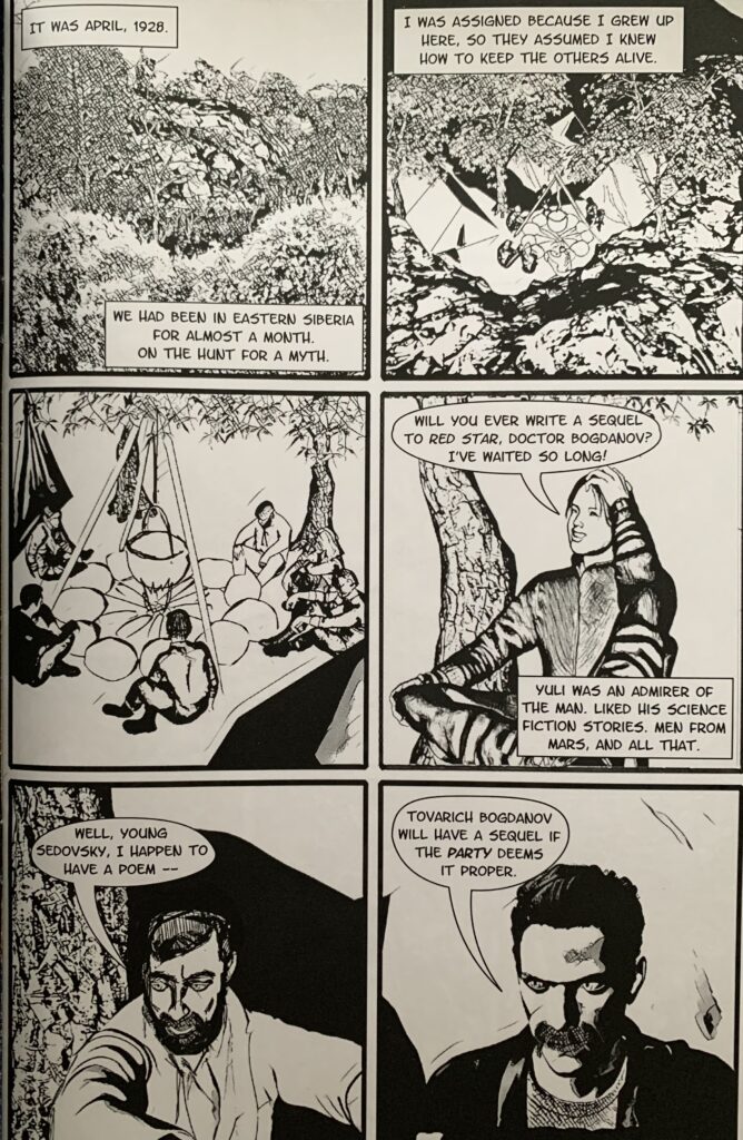
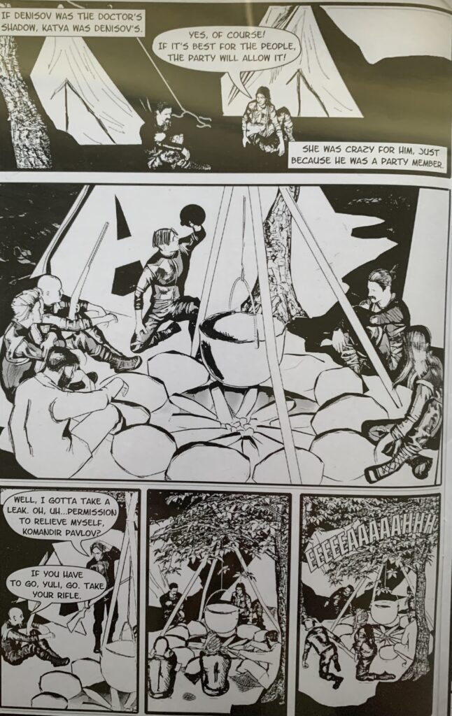
Paul Axel wanted to tap into that delight of the unknown, creating a horror story involving a group of Soviets- soldiers, explorers, & one possibly deranged scientist- on the hunt for a legend. One of the great things Axel’s book has is found in the dialogue between the characters. It’s a pretty standard group, but Axel manages to invest personality in the core group in a pretty short amount of time even for a one-shot comic. There’s a lot of promise there, and I sincerely hope that he holds onto his enthusiasm, builds up some traction, and keeps it going.
If I had to point out a shortcoming in the story, it would be… well… it’s short. Coming in at very lean 20 pages, Axel doesn’t give himself a lot of time to build the suspense promised in the comic’s premise. It probably wouldn’t have taken much more than a few pages, bringing it up to the industry standard of 24 or so, and he could have drawn out some of the action to get his story where it seemed like he wanted it to be. The extra material could have pushed Chuchunya from “pretty cool” to “kinda great”, just on the strength of Axel’s character building and dialogue.
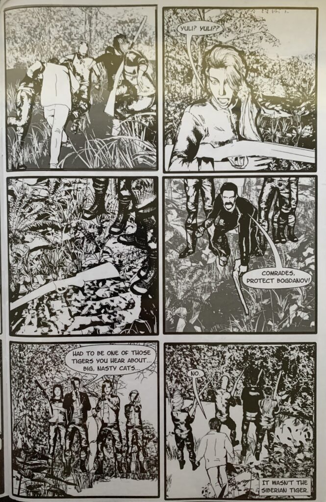
Roel Torres does a pretty good job with the characters, showing a solid grasp of figures, movement, and facial expressions. Something that threw me a bit was his backgrounds. It looked like all the surroundings in the comic were rendered separately for the panels and then the characters were superimposed on top of it. Often, there was the impression that the people had no impact in their environment, or that they occupied the space. Even in the inks, some backgrounds were very lightly rendered while the characters were finished with a sharper, more defined hand. Understanding that working in black & white takes a special knack, Torres might have resolved the issues I’ve mentioned by working in more graded shading to show depth, to add dimension and weight to the characters.
I have nothing but respect for indie creators, and I love the enthusiasm for the act of creation. I sincerely hope that everyone involved in Chuchunya keeps going, building up a resume’ and adding to their skillsets. If you get the chance, hop over to Paul Axel’s page and take a look around. There are more books to see and based on this one they all deserve to be read.
Final Score: 9/13


Thanks for the kind words and the thoughtful review! Yes, there were some panels where I decided to create separation between the figures and the backgrounds. When I originally tried the backgrounds at full strength, the panels looked too busy, cluttered, and hard to read. I was used to working in color and using different hues to separate out objects. The use of a light background was an attempt to make selected panels more readable, but probably wasn’t completely successful as a technique, LOL. Ah well — live and learn. Thanks again! Cheers, Roel