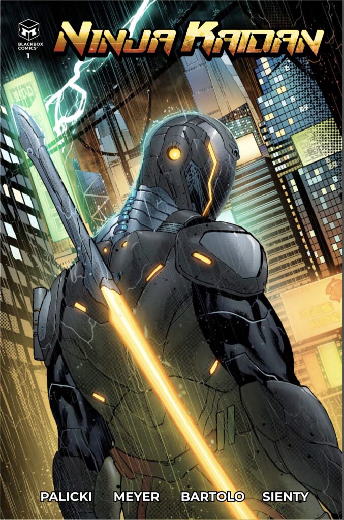
- Ninja Kaidan #1
- Black Box Comics
- Written by Eric Palicki
- Illustrated by Lucas Meyer
- Colors by Michael Bartolo
- Letters by Dezi Sienty
- Created/Edited by Dimitrios Zaharakis
One look at the cover & I was all set to give this comic a try, and all I needed to see was “ninja” in the title to rope me in. I won’t apologize. I’m a child of the 80’s. During my formative years, Cannon films was cranking out what felt like a Ninja movie every other month. And then there were the plethora of other production companies eager to cash on in the mysterious shadow warriors for the screen, both big & small (if you ever get the chance to watch The Master, starring the great Lee Van Cleefe, I’d advise against it).
Where we might run into a speed bump is how well a new ninja comic can stand apart from the crowd, even for an easy mark like me. Sure, a cool cover- which Ninja Kaidan has- will get me in the door, but there has to be something else behind the concept to keep me from bolting. Other comics have done ninja, and other comics have done cool looking high-tech ninja. So what’s new about this?
Lemme tell ya…
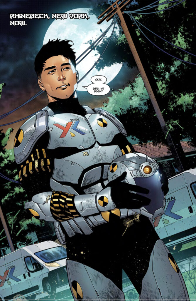
Ninja Kaidan introduces readers to Yuki Snow as he attempts to follow in the footsteps of his recently deceased father. Not as a ninja, but as the head of the tech company Yokai and its cutting-edge research & development. Where this one veers sharply away from the herd is in how the Kaidan armor works. It isn’t in its ability to grant the wearer superhuman strength or off the charts martial arts mastery. The Kaidan armor is designed to allow its wearer to see & interact with spirits. Ghosts. Entities who have yet to move beyond the veil.
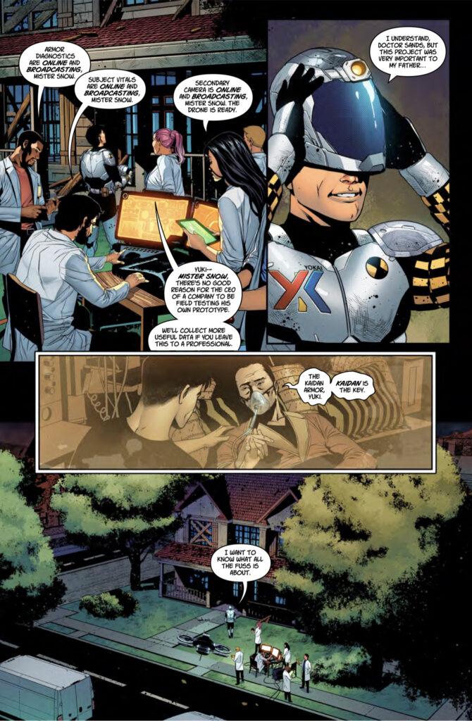
Where the talents & imagination of writer Eric Palicki take things from there is anyone’s guess, but so far his past work has built up more than enough credibility for me to want to find out. Two of his books so far- No Angel & Atlantis Wasn’t Built for Tourists– turned out to be personal favorites of mine and grace my collection of floppies & trades. In Ninja Kaidan, Palicki starts out leaving Yuki’s ninjitsu training in the background, mentioned but not yet pushed to the forefront. The focus stays on the young and newly established CEO in his attempts to honor the memory of his father and grow into this unfamiliar role. He’s also doing a pretty solid job of introducing his core group of characters and allowing them to play out on the page. Readers shouldn’t need to be told that Yuki is an ambitious young man, out of his element but eager to prove himself. We see these traits in him through his interactions and conversations with the people around him.
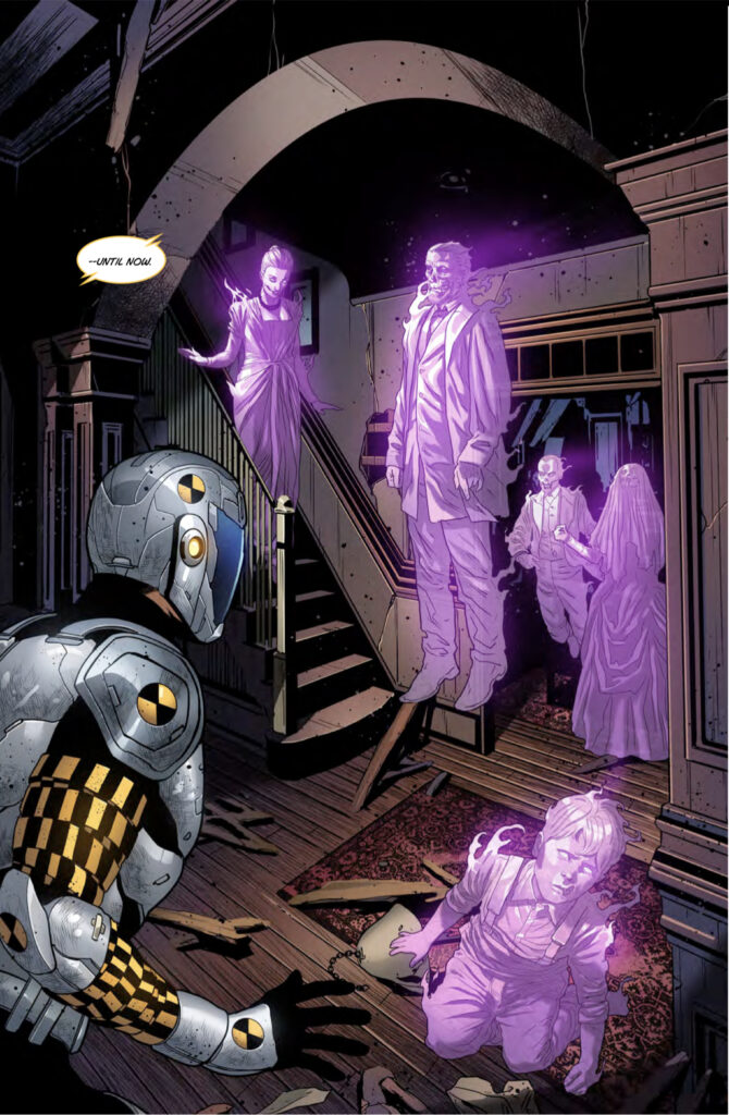
Where Palicki’s job leaves off, Lucas Meyer’s work begins as the artist on the series. I’m a fan of the design that’s gone into the comic so far, the characters for sure but also the Kaidan armor itself. The suit doesn’t start off as the polished & truly slick piece of work we see on the cover. The first scene shows what looks like a prototype being put through its paces in the field for the first time. Bless him, Meyer even has the presence of mind to show the dings & dents a piece of equipment might pick up as it’s put through testing. And when we get to the ghost stuff, pretty early on in the issue, Meyer presents them as wispy, ephemeral apparitions, their features appearing to be in various states of decay.
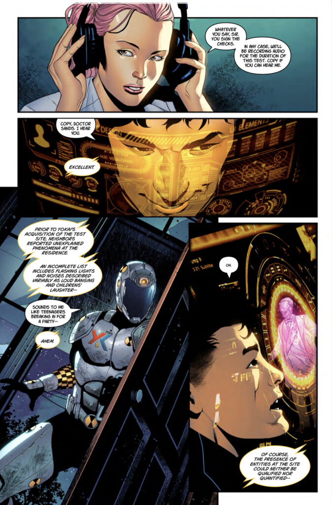
Those spooky looking spirits are brought to… life?… by colorist Michael Bartolo. Going through the issue a second time, I’m seeing that Bartolo has a great knack for special lighting effects. It’s on display with the Kaidan armor’s “Heads UP Display”, the look that was made insanely popular by Iron Man in the MCU, and especially with the ghosts. They aren’t just transparent, but seem to give off a weird glow of their own, an effect that makes them even more otherworldly. There really isn’t a weak point in Bartolo’s use of colors, setting various tones for different settings & scenes.
I have got to give a nod of respect to letterer Dezi Sienty as he adds to the ghostly effects through a creative use of word balloons and fonts. What’s great is that although he does add a stylistic touch to his work, he doesn’t send it over the top. Everything is laid out and easy to read, with none of his work interfering with the artwork on the page. This might sound obvious to some, but if you’ve ever run across an example of really bad lettering, you have an idea what I’m talking about. Sienty falls into none of those traps, keeping the dialogue moving along without a hitch.
I’m a week late with this review, as the first issue of Ninja Kaidan dropped on new comicbook day of last week, July 27th, 2022. But that’s okay, you haven’t missed a bus or anything. If you like stories with ninja, ghosts, high-tech gadgets, good characterization, and the promise of things to come, I think you could do a lot worse than this one. With the second issue scheduled to release on August 31st, there’s still plenty of time to catch up.
Final Score: 11/13
