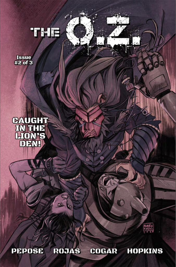
- The O.Z. #2
- Written by David Pepose
- Illustrated by Ruben Rojas
- Colors by Whitney Cogar
- Letters by DC Hopkins
- Variant covers by
- Maan House
- Farid Karami
- Cem Iroz
- Dominic Bustamante
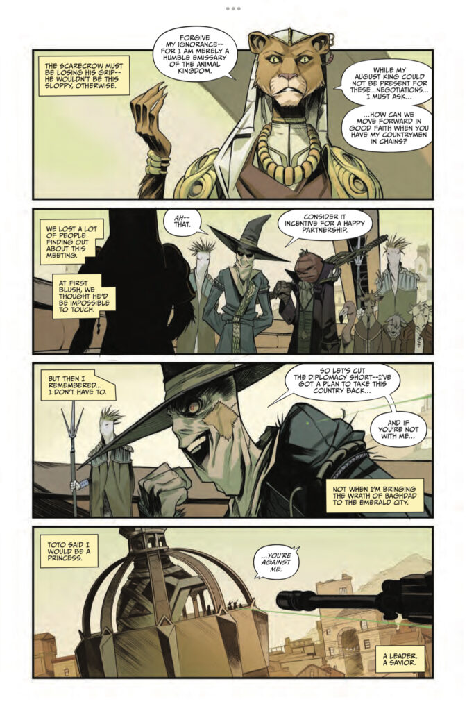
In the war for Oz, the casualties are building. While the cunning and ruthless Scarecrow continues to march his forces in an ongoing chess match, leader of the resistance Toto digs in with the determination of a… uh, a terrier. But with all the pieces in play, there’s one more weapon out there, hidden in the wilds and holding the power to turn the tides of war once & for all…
The Silver Slippers of Glinda the Good.
With the pair separated and stashed away by the Good Witch herself, it’s a race to see who can gather up the mythic footwear first. The stakes are higher than ever, as whoever controls the slippers will be able to travel throughout the multiverse at will!
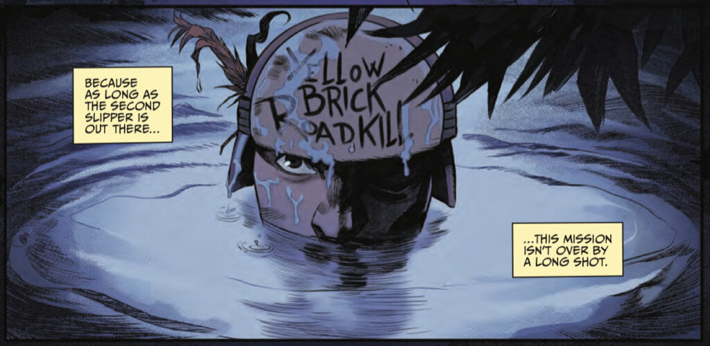
Never let it be said that David Pepose lacks the ability to come up with fresh ideas based on beloved old favorites, or the chutzpah to carry it out. With his previous successes in the rearview mirror (check out our coverage on Spencer & Locke, Going to the Chapel, & Scout’s Honor), he’s doubling down on the genre-bending and trope-killing by combining yet another pair of classic elements to create something new. Again. This time, Pepose is re-visiting the Wonderful Wizard of Oz, first envisioned by L. Frank Baum, and adapted multiple times for the page, stage, & screen. However, as usual his vision is turned away from the norm as he presents all of the familiar characters as players in a gritty war story.
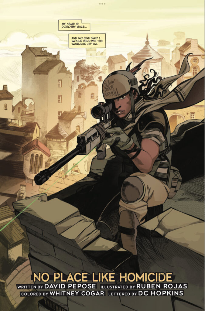
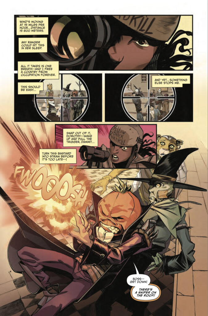
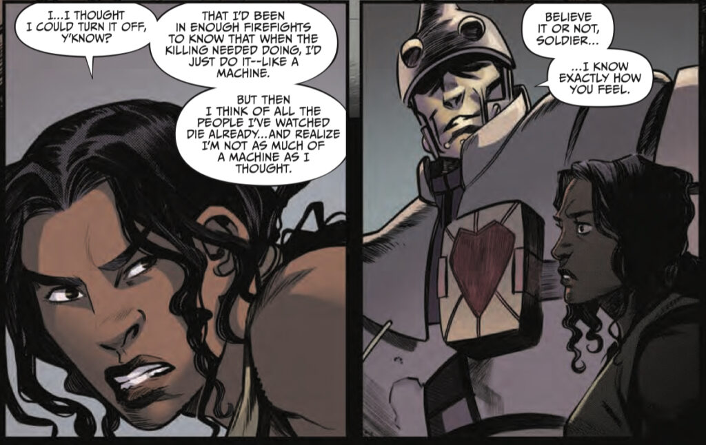
Center stage is Dorothy Gale, granddaughter of the original Dorothy who killed the Wicked Witch and freed the land of Oz from her control. But far from the plucky little country girl, Pepose’s Dorothy is coming off of multiple combat tours in the Middle East. She’s served in every active warzone the United States Army was active in, and she came home to discover that surviving the war was only half of her battle. Like many veterans, Dorothy is finding out in The O.Z.’s second issue that she can’t just turn the soldier off and on when needed. It’s not an uncommon problem, as many real life veterans are finding out as they try to lock the wartime traumas away while settling back into civilian life.
The idea of the deeply damaged combat veteran is something that’s seen a lot of play in recent years, and hopefully Pepose can avoid some of the pitfalls that I’ve heard real-life veterans complaining about. The entertainment industry tends to be portray veterans as either sainted knights in tarnished armor or irrevocably broken victims unable to pull themselves back together. Hopefully, Pepose finds some kind of middle ground for Dorothy as the story moves along, and gives her a satisfying arc with a finish that’s earned. In the meantime, there will be banter and foxhole humor aplenty… although Dorothy tagging the Tin Soldier with the nickname “Rivethead” is a little on the nose.
With all of the heavy emotional content going on, it’s definitely worth noting that this is still a comic book. Since all of the really good comics on the market come with pictures, let’s talk about that for a minute… Throughout all of Pepose’s comics, the one thing that has NOT followed him from one title to the next has been a visual style. Spencer & Locke (Jorge Santiago Jr) had a very gritty take on characters out of the Sunday comics. Going to the Chapel (Gavin Guidry) took a very bright approach that gave the book a lighter tone. Scout’s Honor (Luca Casalanguida) reminded me of nothing so much as all of the best adventure comics from the Gold Key of my youth.
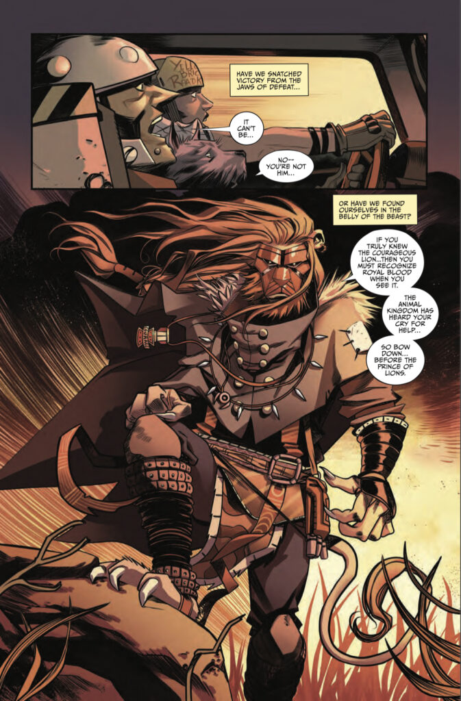
The O.Z. has a visual appeal all its own, a look established fast in issue #1 where flying monkeys are diving from the sky clutching bombs with phrases like “Darwin’s Revenge” scrawled across them. Ruben Rojas’s illustration has all of the dynamic application of precision cover fire in a tactical withdrawal. When needed, Rojas handles the quiet moments required for Dorothy and the Tin Soldier discussing why war really is hell. Then, at the turn of a page, Rojas cranks it to 11 as he brings all of chaos of a running firefight without sacrificing character traits and details. With the added touch of color by Whitney Cogar, The O.Z. is filled out and its environments made clear & distinct. Each scene and subsequent setting are given their own basic color set to establish tone and locale.
My normal hesitance with exclusively crowd-funded comics, that the length of time between servings risks letting the dish go cold, is somewhat avoided by the length of The O.Z.’s issues. The first two have come in at around sixty pages, offering a little more time for readers to settle into the story and giving them more to chew on while waiting for the next instalment. Still, the good and the bad is that before reading issue 2, I did have to go back to issue 1 for a refresher. Overall, it isn’t a huge problem (see, it’s good cuz I got to read a solid story again) for the patient reader and realistically it isn’t much of a stretch from trying to keep up with 25-page monthlies.
The O.Z. brings together a more complicated set of story elements, shifting between the military action of Blackhawk Down and the feelings of displacement beautifully played out in The Hurt Locker. While David “the Trope Slayer” Pepose hasn’t been able to totally avoid the traps of retelling old stories, his approach is solid. With some outstanding visuals from Rojas & Cogar, and the final touches by the always excellent DC Hopkins in lettering, I’m looking forward to seeing how the final chapter handles the landing.
Final Score: 10/13

