- Buffy the Last Vampire Slayer
- Boom! Studios
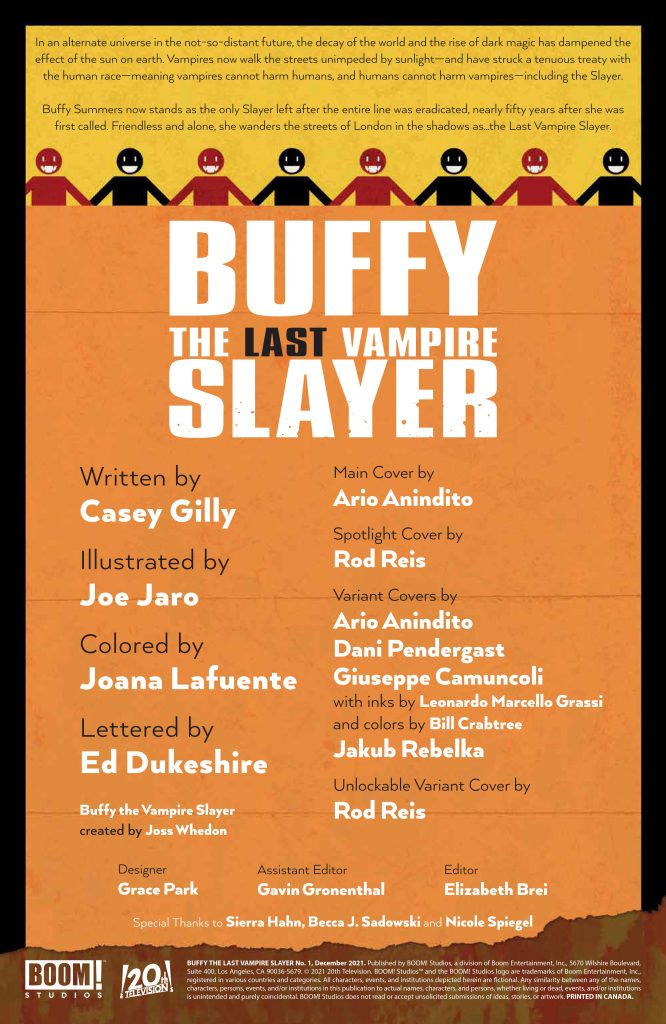
- Written by Casey Gilly
- Illustrated by Joe Jaro
- Colors by Joana Lafuente
- Letters by Ed Dukeshire
- Covers
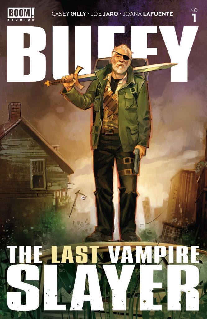
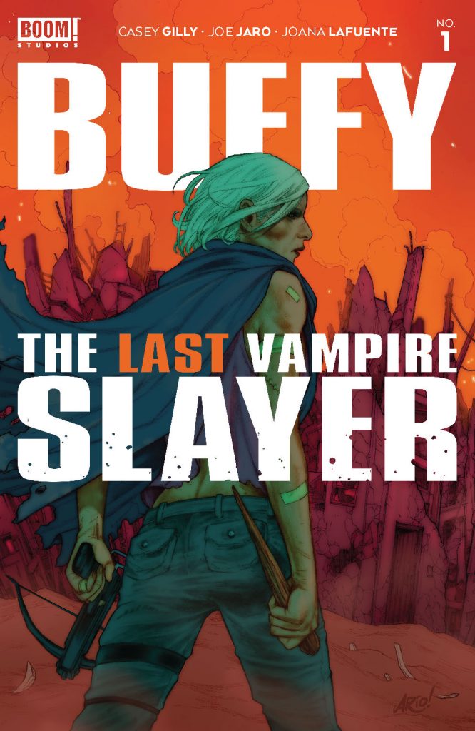
- (Main) Ario Anindito
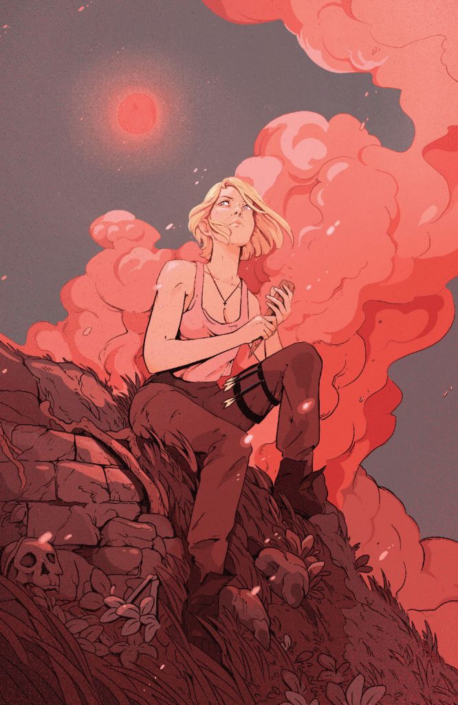
- (Spotlight) Rod Reiss
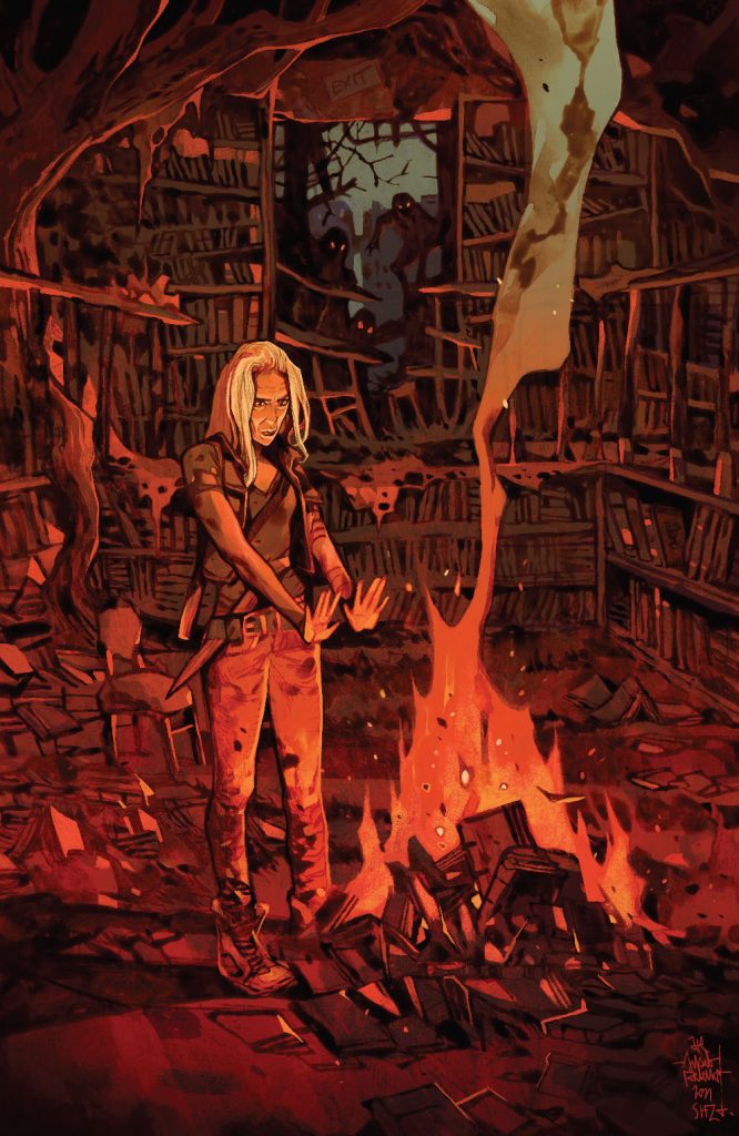
- Dani Pendergast
- Guiseppe Camuncoli
In an alternate universe in the not-so-distant future, the decay of the world and the rise of dark magic has dampened the effect of the sun on earth. Vampires now walk the streets unimpeded by sunlight and have struck a tenuous treaty with the human race- meaning vampires cannot harm humans, and humans (including the Slayer) cannot harm vampires.
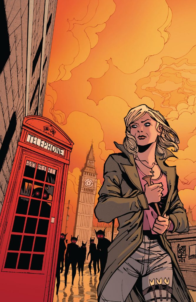
Buffy Summers now stands as the only Slayer left after the entire line was eradicated, nearly fifty years after she was first called. Friendless and alone, she wanders the streets of London in the shadows… The Last Vampire Slayer
Across all forms of entertainment media, the trend is king. Old Man Logan. Old Man Hawkeye. The Last Ronin (I am kinda glad they opted to go with this angle instead of an “Old Lady Buffy”). What the fans want/buy, the fans will get… in droves until every good idea is used up and publishers are churning out dregs. Then it’s on to the next trend. Right now, what the fans are getting is a deep dive into some speculative storylines rounding out the later years of the characters they love.
Trends can be really kind of a drag. But they can also push some creative envelopes and mine established canon for some cool new angles into old ideas. Where The Last Vampire Slayer will fall in that seething mass of variables is yet to be seen, but its start is onto something good.
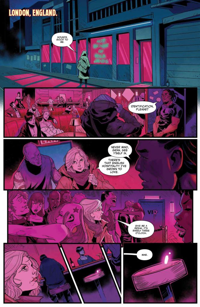
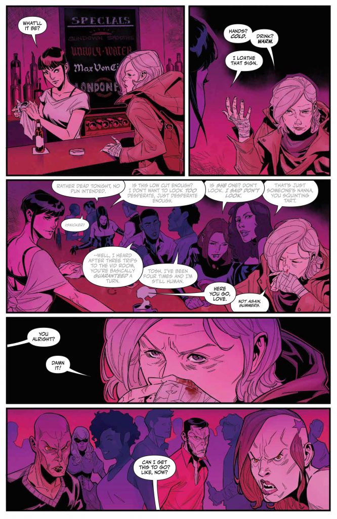
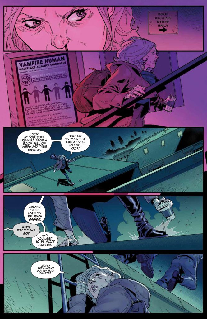
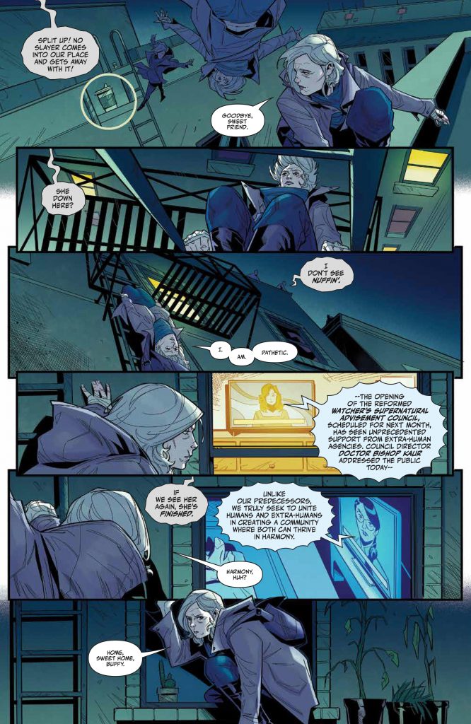
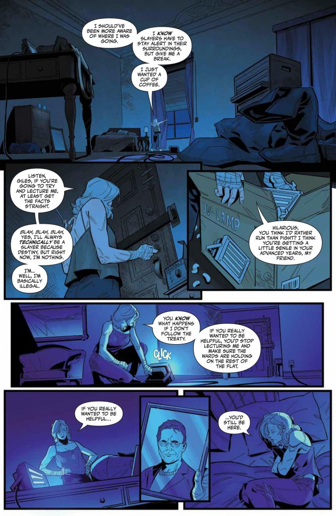
Easing us into this brave new world of peace & prosperity between humans and vampires, the reader is dropped into the mix without preamble. A middle-aged Buffy Summers walking the streets of London in search of a cup o’ Joe to warm herself. Stepping into a hopping establishment, she finds her cuppa, but discovers this particular crowd is heavy on the undead side. Over the course of this scene, writer Casey Gilly dips the reader into her story’s finer points. First off, this is the Buffy fans are going to remember, all quippy and wry… just a little more seasoned. Second, and maybe more interesting as details are brought out, something happened to cause a kind of allergic reaction to vampires in Buffy as her first indication that she might have walked herself into trouble is a nosebleed. What follows is the inevitable chase scene, a moment of melancholy as Buffy ponders lost friends, and sort of a dream sequence flashback to give the reader some perspective. Gilly walks us through all of this, taking us by the hand without seeming to drag us along. We’re given the chance to pick up bits as we go without feeling like there’s a narrative finger pointing and demanding “Look, there! That’s enough, let’s go!” Established fans have the chance to sightsee a bit, to catch up on events that have unfolded over the missing years, and new readers can dip a toe into the Buffyverse before things really get rolling.
Lending the visuals just the right amount of roughage, Joe Jaro stays away from a too-clean look that would take away the passage of time. As we follow through her night’s quest (cup of coffee, remember?), she’s every bit the scarred veteran of countless battles, looking like an aged up version of Post-Apocalyptic Buffy from one of the “Dopplegangland” episodes. As on point as Gilly’s writing for Buffy is, Jaro’s visual cues pick up on some of her more subtle traits. Far from the physically imposing specimen some might expect from “she who must battle against the darkness”, Buff is really kinda little. That’s always been one of the cooler contrasts in the character, and I’m glad that it’s shown here. But as seasoned as she is, there’s kind of a furtiveness to Buffy’s demeanor as she moves about London’s streets. This isn’t the Slayer on mission and ready to throw down, but someone who’s starting to doubt her relevance and is just trying to get through the day unnoticed. That actually shows in Jaro’s work, an added bonus to help sell the tone of The Last Vampire Slayer.
All of this… the attitude, the story’s tone, the atmosphere… is given its final touches through efforts of all of the book’s creative team. Joana Lafuente‘s colors accentuate the direction Jaro takes with his line work, sharpening the shadows and allowing just enough of the rough to show. Back on the shadows, that’s going to be an important point for this book, as we are talking about a world where the sun doesn’t shine and vampires are free to walk about the cabin at their leisure. For his part, Ed Dukeshire uses lettering to help tell the story, giving certain perspectives a definitive look (and maybe getting a little too emoji happy along the way). His work always seems to shine, even in comics that don’t give him as much room to run.
Catching onto the original show in its second season, I’ve been on the Buffytrain for many years. My wife and I still go back to some of the great episodes when the mood hits to revisit our favorites- Hush, Tabula Rasa, and the aforementioned Dopplegangland among them. The Boom! series has done a good job of using the “soft reboot” to be able to go back into the old stories from new angles and updating characters who were pretty cutting edge in their time. Now we’re heading in the other direction, pushing the Slayer forward and into a new set of challenges. The opening issue is a strong one… let’s see where it goes from here.
Final Score: 10/13
