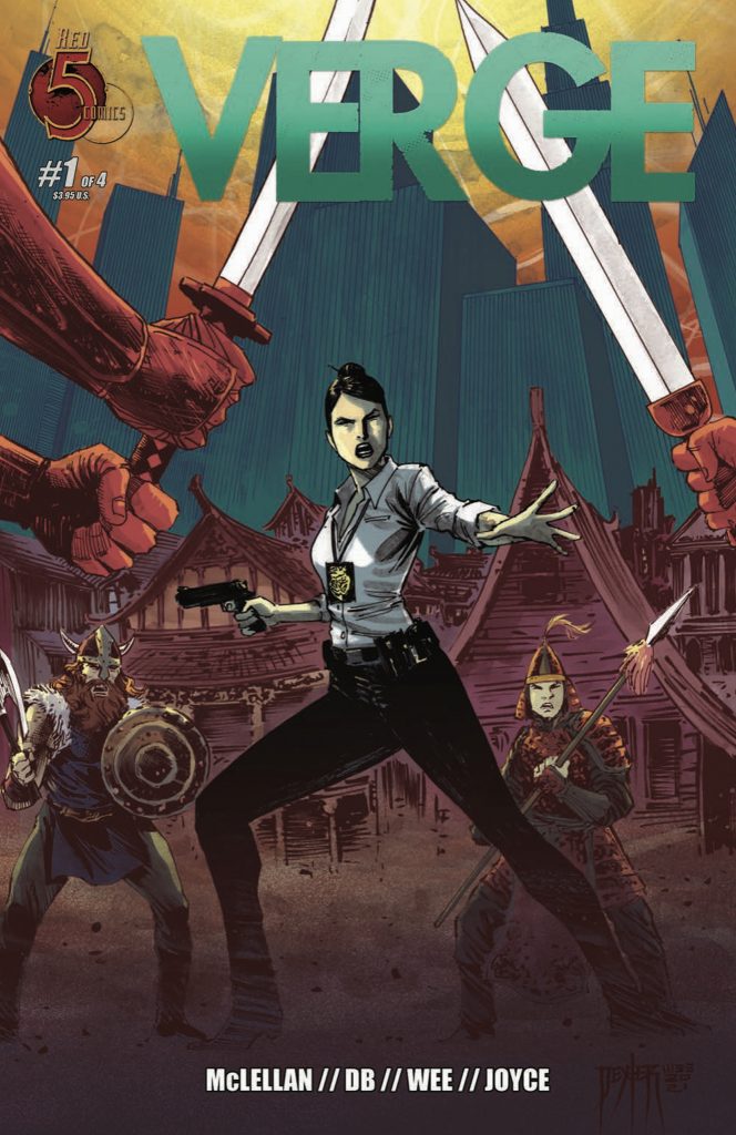
- Verge
- Red 5 Comics
- Written by Bryce McLellan
- Illustrated by Silvio dB
- Colors by Louie Joyce
- Letters by Sean Rinehart
- Cover by Dexter Wee
- Coming in September
A city on the edge of time…
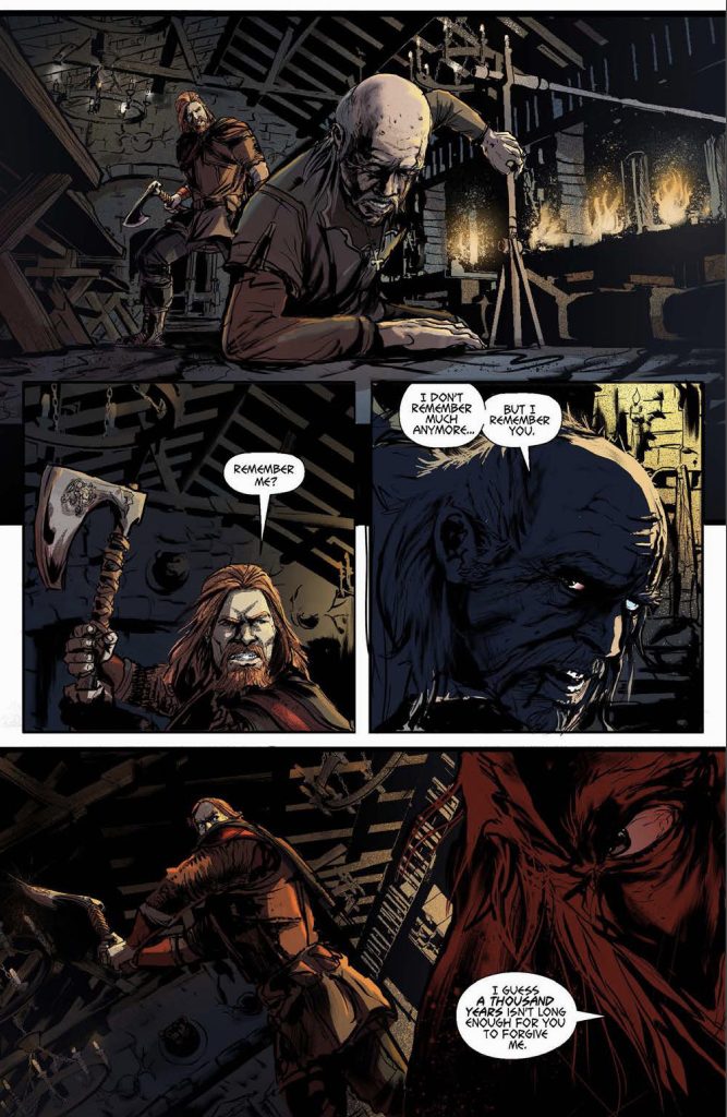
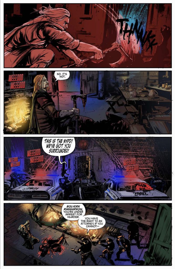
One day New Your City was a melting pot, another it was a real melting pot. That was the day the doorway to time opened and refugees from the past disasters came spilling out. Vikings, Cavemen, Romans, Samurai, Mongol Warriors and more now all living side-by-side and it’s up to the NYPD to keep them all in line.
See, it’s Men in Black, but with time displaced refugees from every culture and era instead of aliens. It’s Timecop in reverse, where the police aren’t patrolling history to protect the present, they’re keeping the lid on a Manhattan that’s been broken up into districts like “Little Babylon”, the “Zulu Republic”, the “Mayan Quarter”, and “Vikingtown”. Who makes up the thin blue line standing in the face of that boiling cauldron of chaos?
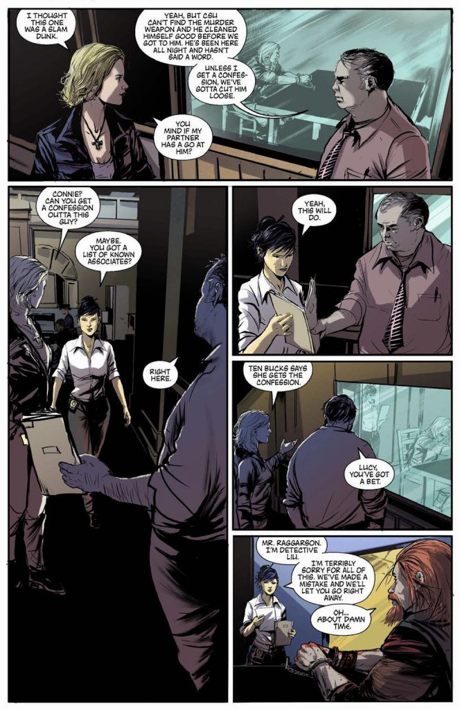
Meet the cops of the 13th Street Police Precinct, the front-line warriors keeping the peace and dealing with people out of time. Many of whom, it’s worth mentioning, don’t really believe that “peace” is to be regarded as a worthy goal. Detectives Lucy (no last name given) & Connie Liu (obviously the main character of this comic) work their beat and have the reputation of being among the best when it comes to dealing with the new old inhabitants of Manhattan. The reward for all of their hard work? They get to take on the responsibility of taking care of newly minted detective Ravi Burns- son of the Police Commissioner- who’s determined to step out from his mother’s shadow and see the mean streets for the very first time.
I’m gonna come straight out and say it. I love this concept, originally written as a TV pilot and now to be released as a comic series. It’s got the grit & attitude of a police procedural, with all of the curveballs you can imagine when throwing this hugely diverse mix of cultures together. Bryce McLellan is the writer taking charge of the heaping salad bowl of insanity, and while I imagine it must have been fun, there’s no way it could have been easy. “Easy” would’ve been to keep the different sub-divisions segregated, apart from each other to do their thing as they please. Instead, McLellan rolls up the ol’ shirtsleeves and digs into what might happen if these different groups maintained their neighborhoods but were still free to wander & mingle about Manhattan. Look back at New York of the early 19th century and you might get an idea of what that would be like. And then look at the job of the New York Police Department at that time. It was a career that no one but the crazy few (and the Irish) actually wanted. All of these factors give a taste of the environment McLellan has percolating in the confines of his story.
If it’s Bryce McLellan’s job to make the story elements work, it’s up to the artistic team of Silvio dB & Louie Joyce to make it look good. There’s no other part of issue one that better encapsulates the essence of Verge for me, than Silvio’s two-page spread set just outside of the police precinct. It’s a true hodgepodge of culture clash featuring cowpokes from the American Old West, an Egyptian Pharoah, a Roman out recruiting gladiators, and a pair of drunken out of work Vikings (one of whom is wearing a Nike tshirt). And those are just some of the people walking around. The background is full of great nods, with a Viking meadhall, a billboard featuring an Egyptian goddess selling something called “Lotus-Coke”, and a Shinto Temple off in the distance. It’s a defining moment for the issue, and Silvio nails it!
Lending some depth to the hustle & bustle of this Manhattan, Louie Joyce couldn’t have done it any better. Again, I’m looking to that two-page spread and I’m amazed at Joyce’s ability to catch the tone of a busy city street in the morning. Densely packed buildings set in shadow to one side, while the street itself is well lit to focus the eye on some of the more immersive details. In the distance, the New York City skyline has just a bit of a haze to show that a rupture in space-time hasn’t done anything to clear up our pollution problem. I think if I were really looking for an aspect of Joyce’s work that stood out to me, it would be in the use of colors to create obscuring effects. I’ve mentioned shadows and smog, but another great detail is seen while the characters are driving through town, looking out through the car windows as the reader is treated to what they’re seeing in the reflected images. It sounds like a little thing, but to me it’s the most obvious point where Joyce’s color work meets Silvio’s lines to create something greater than the sum of its parts.
Finally, the lettering… this isn’t always an aspect that’s easy to review in comics, mainly because the ultimate goal of a good letterer is to work their magic under the radar. The more you notice the lettering, the greater the chance that it can get distracting. The most notable thing in Sean Rinehart’s work is the font choice in the dialogue of the temporally-challenged time refugees. Once I got deeper into the issue I was reading it as sort of a dialect amalgamating a mixture of all of the different languages represented in these pages. McLellan opted not to make that dialect obvious in his script, thankfully because that could have gotten difficult to stick with as a reader. Instead, it’s all written as plain English, with just that subtle creative flair by Rinehart to set it apart.
I keep coming back to the idea that Verge couldn’t have been an easy comic to make, but as I’m looking over the issue for a third time I can’t help but wonder how much fun the team had with the challenge of it all. The whole idea is insane and it would have been easy for it to fly out of control, but Team Verge took a more matter of fact or understated approach and kept the focus on the story itself. The result most definitely worked for me, and as things start ramping up toward the end of this issue I think that approach is going to pay dividends.
Final Score: 12/13


