- Scout’s Honor #4
- Aftershock
- Written by David Pepose
- Art by Luca Casalanguida
- Colors by Matt Milla
- Letters by Carlos M. Mangual
- Cover by Andy Clarke & Jose Villarrubia
When last we left our intrepid survivalist & newly appointed Ranger Scout, Kit, the jig was well & truly up. Not only caught digging into the heavily redacted history books, but also outted for breaking the sacred Third Law of Scout Brotherhood, Kit is guilty of hiding her gender in the all-male organization. No longer welcome in the place she’d always thought of as home, alone in the Badlands with nothing but an automated drone as an ally… Doctor Hancock preserve us, what‘s next?
And no protests of “spoilers”, cuz we’ve known Kit was a girl for a couple issues now. Keep up.
Scout’s Honor is the latest outing for the aptly labeled (by my good friend and fellow Pullboxer, Andy) trope killer, David Pepose. He hit the ground running back in 2017, shredding the beloved Sunday newspaper comics of my youth in Spencer & Locke. Next, he tore through the oft-used but never so sorely abused heist caper with Going to the Chapel. He can currently be found stomping around the Land of Oz in his militarized The O.Z. With all of that, it’s obvious that Pepose is making it a point to never stay in one place for too long.
Naturally, the post-apocalyptic action outing couldn’t have been far behind, but there was no way Pepose would just play it straight. No burned out cops roaming the wasteland in the last of the V-8 Interceptors. No converted war rigs trundling across the Outback in search of gasoline… or maybe even a nice steak. In the mind of David “never met a plot device I didn’t like” Pepose, there’s no better target to set his sights on for surviving in a world of mutants & mayhem than the Boy Scouts of America.
To be fair, Pepose’s Ranger Scouts are a far cry from that august organization with a long-standing reputation for promoting high ideals and morals in young lads. In the world of Scout’s Honor, kids are indoctrinated, trained, & hardened through trials that would give a Navy SEAL pause. Kit is no different, having been rescued from certain death as a child by a Ranger Scout. From those beginnings, she grew up envisioning that heroic figure as the ultimate expression of noble purpose. It was all she wanted to be, all she could see herself becoming, from that day forward.
That’s where I thought Pepose’s story really took the turn. It would have been too easy to make a different kind of statement, to put Kit through all of it just to shine a light on a system that would let worthy champions fall to the wayside over a matter of gender. I’ve seen G.I. Jane, and this is a totally different thing. Kit’s a true believer at the core of her character, sincerely believing in her course as a way of honoring the longstanding tradition as opposed to any form of protest against disparity. It’s not until she learns the darker truth behind the shiny façade that her belief is shaken.
Steel isn’t hardened until it’s been put into a fire, pounded into shape, & tempered. Kit is no different.
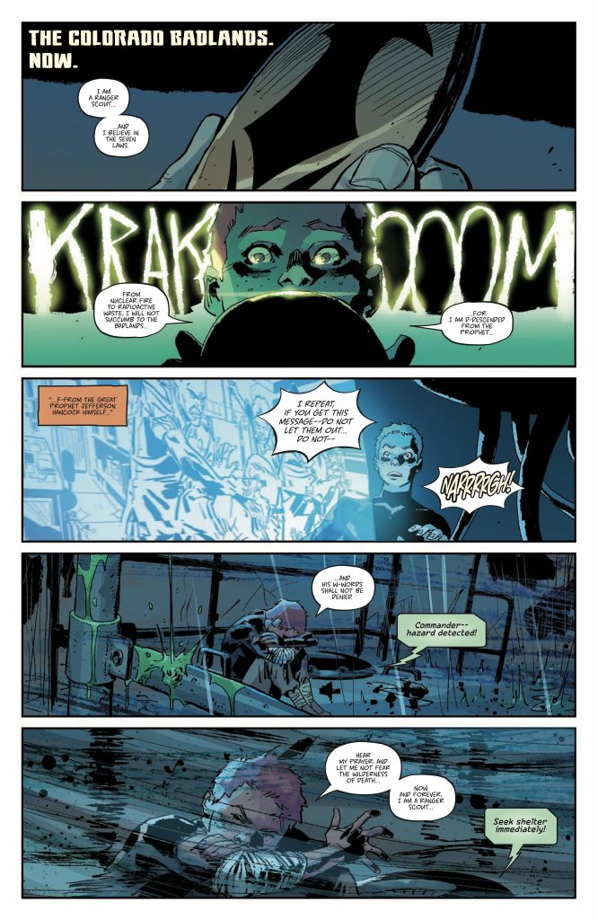
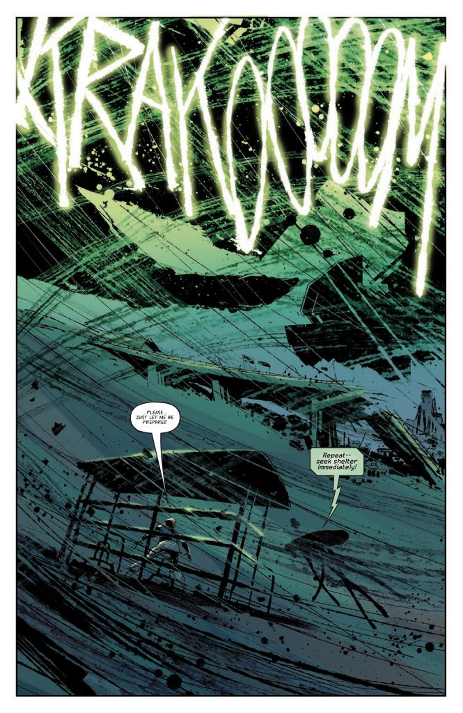
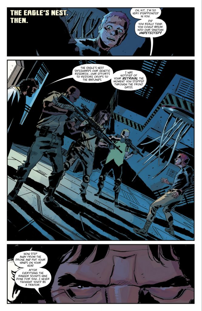
Bringing this story of action & heartache to the page is the artistic team of Luca Casalanguida & Matt Milla, illustrator & colorist respectively. Casalanguida has a rough style, handling his artwork in a way that can’t be considered “pretty”, but is well suited to Scout’s Honor. In Kit he’s crafted a lean, mean fighting machine, tough as nails and quick as the crack of a whip. It’s not a huge stretch of the imagination to believe that she could pass for a young man with the help of some wrapping tape. Resources are scarce on the edge of the Badlands, and there wouldn’t be many people tipping the scales in body fat or muscle mass. Likewise, Milla’s color palette works with a liberal use of earth tones and stark, concealing shadows for contrast. When their powers combine, it sets the overall tone of the book like a really pissed off Captain Planet.
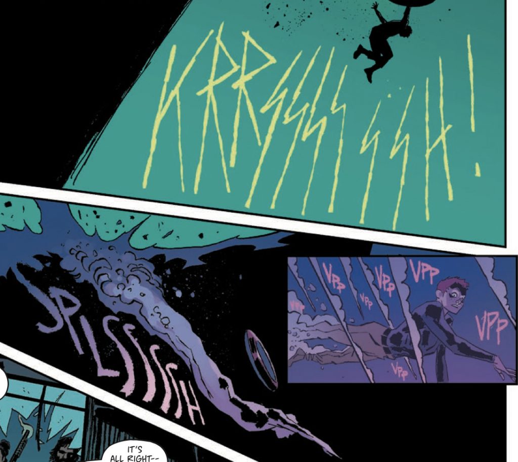
It’s pretty well established that I’m always impressed when the lettering in a comic goes farther than simply relaying dialogue & text. True enough, those mainstays are handled here by Carlos M. Mangual and it’s as fine a job as can be expected. Even in the more dialogue-heavy panels, Mangual doesn’t let text interfere with the artwork… a thing that couldn’t have been easy given how densely packed some of these pages are. Now, whether it’s the work of Mangual or an extension of Casalanguida’s art, where Scout’s Honor hit a lettering grandslam is in the way sound effects are incorporated into the panels. Whichever the case, it’s a fantastic example of how to use words to accentuate action. Take a look at this sequence and tell me I’m wrong…

This is number 4 in a 5 issue limited series, so now is the time to get in on it if you haven’t been reading already. Scout’s Honor is available digitally through your favorite comic ap, but I’m hoping for a physical trade release. The latest in a growing list of “must haves” for my bookshelf from David Pepose and his gang of collaborators, all I really need now is to find out what’s next for the Trope Slayer.
Final Score: 12/13


