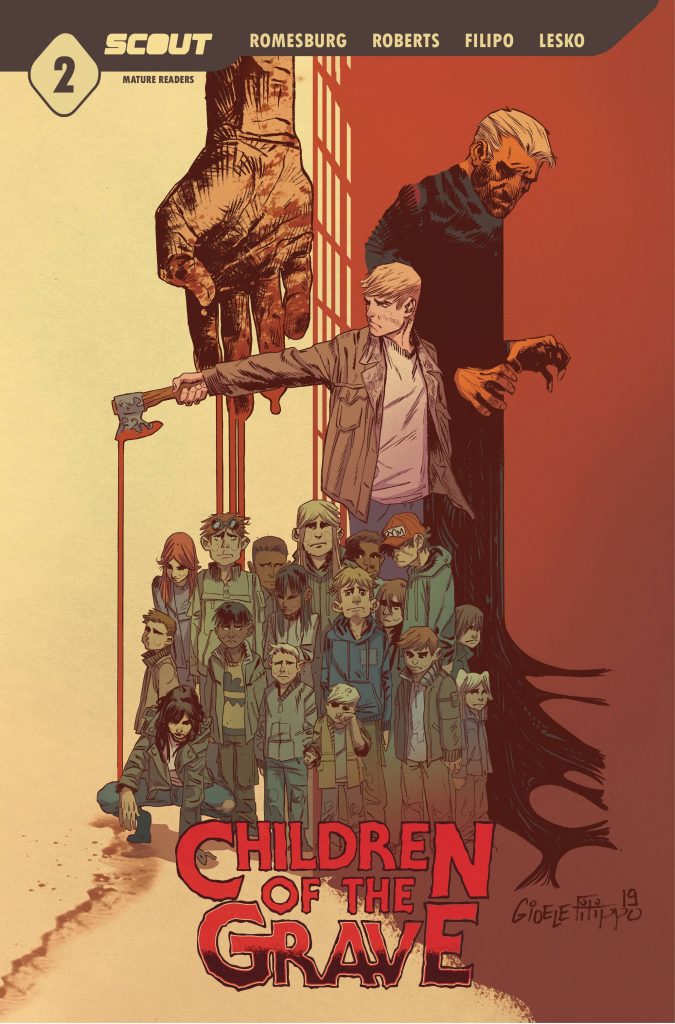
- Children of the Grave #2
- Scout Comics
- Written by Sam Romesburg & Ben Roberts
- Illustrated by Gioele Filippo
- Colors by Marco Lesko
- Letters by Justin Birch
- Logo designed by Jake Beaver
- Edited by Charlie Stickney
- Production by Joel Rodriquez
- In shops February 10, 2021
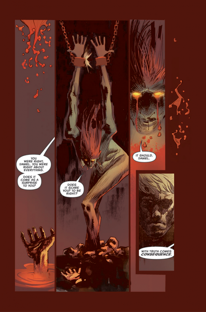
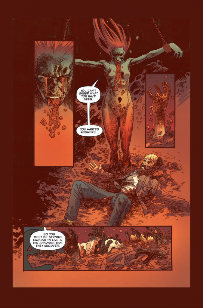
The mysterious woman has revealed herself to Daniel as “The Mother.” Can she be trusted? Someone in Terra knows what Daniel is up to and has made him a target. If things weren’t safe for Daniel before, they are now treacherous.
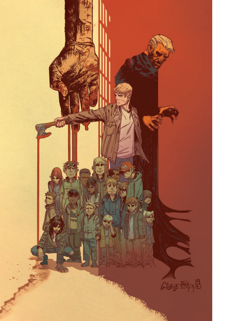
For as long as anyone can remember, no one has gone without anything or had to work for what they had. All of their wants & needs have been met by mysterious “Providers”. Elder Brother Cruise, the oldest living person anyone can remember at the ripe old age of thirty, holds power over the settlement and his words represent the wishes of the Providers. While Daniel has always been difficult, his doubts have challenged Brother Cruise’s authority for the last time.
How much does Brother Cruise know? How far will he go to protect the sanctity of the settlement? Who are the Providers? This is only the second issue, kids. Settle down and get comfy, cuz it’s looking like Children of the Grave is going to be a bumpy ride.
I’m not gonna say that I’m jaded (don’t snicker, Andy) but after I read Andy’s review of the first issue, I just wasn’t convinced that this story was as twisted as he was letting on. The world spun on and I finally got a chance to see just what he was talking about. Then, as I turned to the last page, I kinda thought that Andy might’ve been underselling it a little. “Disturbing” is about the only single word I can think of to describe the closing of issue 1.
Well it’s a well-known fact that I’m kind of a glutton for punishment (seriously, my wife will back me up on that). When thePullbox crew got hold of a review pdf for the second issue just a day after I read the first, I called dibs for the review right away. Children of the Grave may not be for everyone but it’s exactly the kind of suspenseful, wholy original story-telling that has come to stand out as the biggest difference between independent publishers & the Big Two.
The writing team of Sam Romesburg & Ben Roberts are digging deep into this crazy world they’re building. The first issue established the settlement of Terra as an idyllic place, where no one is left wanting and everything is provided. The lone voice of dissent among the young people of Terra is Daniel, and Romesburg and Roberts have imbued him with the determination to explore, to question. Who are the Providers? What was the world like before Terra? How is it that no one among the settlement’s populace was actually born there, but discovered as babies to be taken in and raised? The number one rule in creating a solid story is in presenting your readers with enough information to make them want to learn more, to keep reading. But rather than tossing it all out in one big info-dump, these guys are slowly doling it out and leaving readers hungry for more.
For the kind of suspense being built in Children of the Grave, the visuals are going to play an important part. The team of Gioele Filippo & Marco Lesko have combined their powers, and like the legendary masters of Shaolin they are mighty. Yeah, I’m pretty sure the Shaolin Masters couldn’t really combine their might like robot lions forming Voltron, I just watched a lot of Shaw Brothers movies as a kid. What I do know is that the artwork on this title works with the story to build up the just the right attitude. Filippo’s line work isn’t neat, tidy, or smooth. It’s rough, often messy, and provides the perfect context for readers to take in this strange new world. Filled out and given depth by Lesko’s colors, that world becomes something that’s constantly hiding the next lurking reveal. On the surface, everything is green & healthy… but like the rot beneath the skin of the apple, the next page could show us something horrifying.
Or worse… half a worm *shudder*.
Damn, I almost forgot to talk about the lettering for this book. On the one hand, a person might think that something so low key as to go unnoticed might not be something to talk about. A person would be correct if we were talking about anything but lettering. The job is thankless because the very best letterers get the job done so smoothly as to often be forgotten. Justin Birch performs that minor miracle every time his name is attached to a book. Dialogue runs through the panels without interrupting or distracting from the artwork- kind of a big deal in a comic book.
Readers, be prepared for some shocking imagery, mature themes, & adult language. Like Daniel exploring the ruins of the world outside the settlement against the wishes of Brother Cruise, we’re going to have to dig in and be ready for whatever gibbering horror is waiting around the corner. Like Daniel, when we see it we’re going to doubt our life choices so far. Like Daniel, we know that we’re going to have to bear down and push on because once you know, there’s no way to unlearn.
Final Score: 11/13
