- The O.Z. #1
- Written by David Pepose
- Art by Ruben Rojas
- Colors by Whitney Cogar
- Letters by DC Hopkins
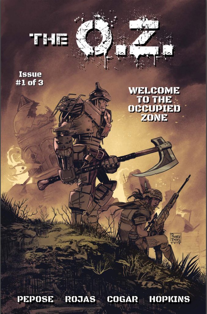
Dubbed by thePullbox’s own Andy P. “the Trope Slayer”, David Pepose has once again set his sights on a beloved classic, and gutted it like a fish. Since his debut title Spencer & Locke, followed up by a second story arc and a genre bending spin on the heist caper Going to the Chapel, Pepose has zeroed in on The Wizard of Oz as his next target. There won’t be any singing or dancing in this version, folks, unless the flying monkeys take one more step into the realm of nightmare.
Fresh off of a very successful Kickstarter campaign, The O.Z. wastes no time dumping the reader into the middle of the dystopia that Oz has become. Left without any real leadership in the time since both the Wizard and Dorothy Gale left the Emerald City in the rear view, an oppressive new regime has moved in. The resistance has fought back with savage zeal, but their forces are scattered and without a single unifying voice to bring them together. What they need is the legendary Dorothy Gale. Or possibly her granddaughter.
Corporal Dorothy Gale, U.S. Army, reporting for service.
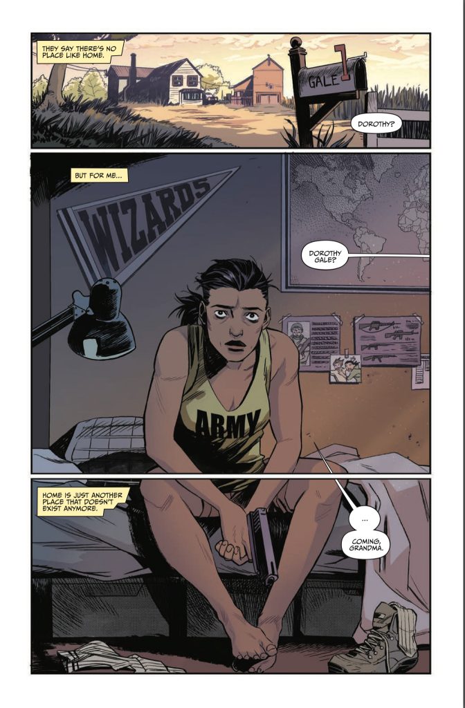
One of these days, David Pepose is going to wake up in the morning and start writing a story where all of his characters are happy, well-adjusted and free from a life of pain. This is not that day, and The O.Z. is not that book. Just as Oz hasn’t turned out all that well over the years, so it is with Dorothy the younger, an Iraqi war veteran who hasn’t even begun to cope with tragedies she’s seen. Pepose digs deep into the effects of psychological trauma, much like he did in Spencer & Locke, this time highlighting the effects of PTSD on the mind of a trained soldier.
What Pepose does well here- better than most- is showing how the quiet moments, when she has time to think, prove to be the bane of her existence. She functions pretty well as long as there’s something in front of her to focus on. The military mindset is one of “mission first”, and it’s drilled into the subconscious so that the soldier can push the traumas of combat aside, lock them away in order to focus on the objective. But everything that’s ever been locked away will eventually get out, in the form of nightmares, flashbacks, bursts of temper, and worse… all waiting for those moments of introspection to jump out. Dorothy Gale is riding the edge of these outbursts, and Pepose shows the reader just how close she is to closing her eyes and taking that last fall over the edge. The great thing is that the narrative doesn’t come across as heavy-handed , instead taking a more natural approach as Dorothy tells a bit of her own story. We’re given some insight without feeling like we’ve been led by the hand.
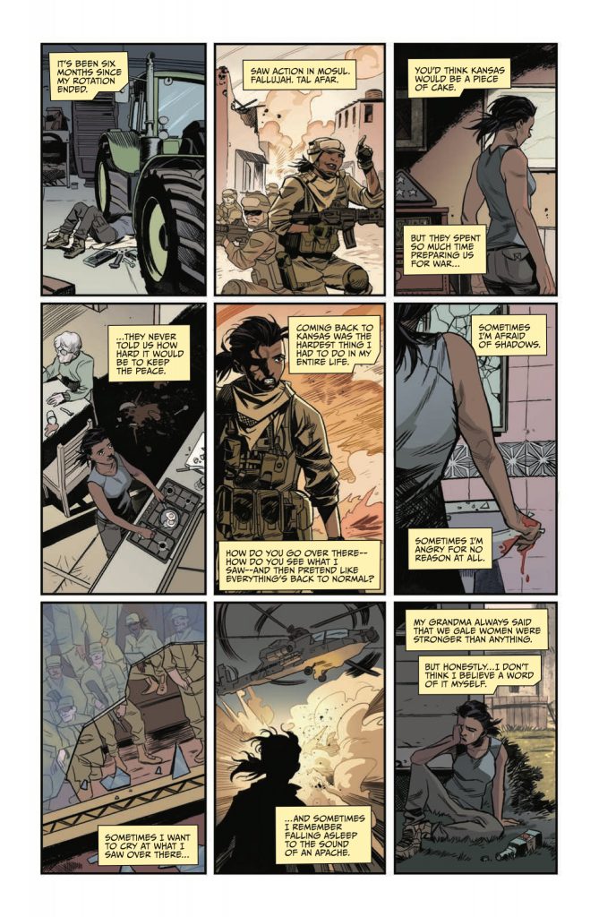
This is all done in the opening pages, following Dorothy along in her day to day life as she comes to the understanding that living a “normal life” is easier said than done. It’s when the story kicks over that we get to sit back and dig into the heart of The O.Z. as Pepose starts bringing it all together. The magical Land of Oz and its inhabitants, characters we’ve always loved and thought we knew, still feel the shockwaves of the first Dorothy’s visit that continue to shake the landscape. This might be where the more casual reader finds their comfort zone as the action starts to ramp up and Pepose goes from slicing psychological commentary to bludgeoning violent action.
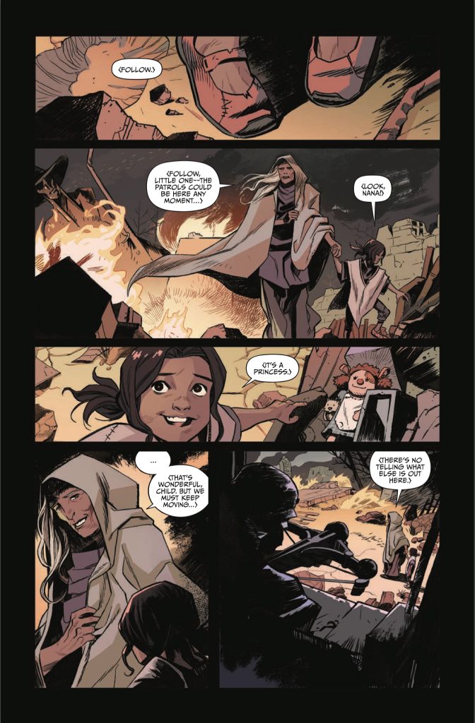
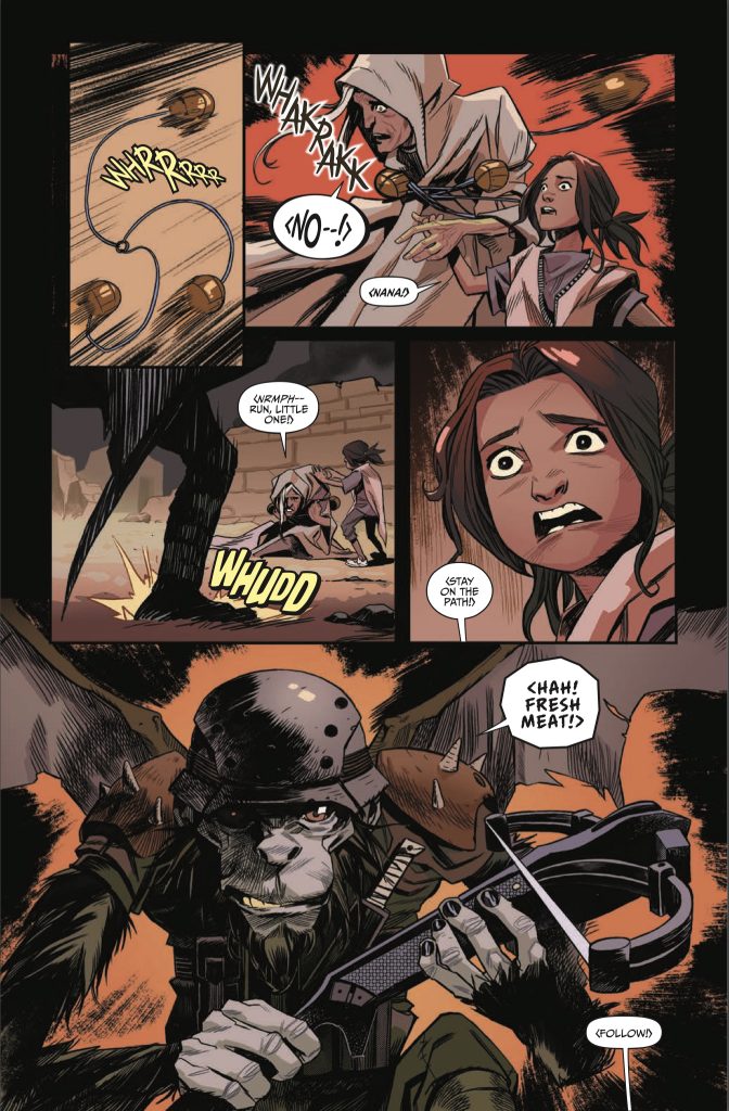
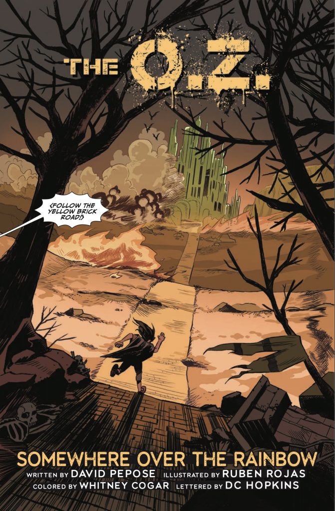
Part of what makes that action work, aside from the carefully scripted chaos, is the artwork of Ruben Rojas and colors by Whitney Cogar. There are so many, too many individual panels that tell the story beyond the words. Rojas has a visual style that just works, whether we’re looking at a dramatic close-up silhouette of Dorothy deciding that it’s “time to go home”, or a full page image of enraged flying monkeys proclaiming “Darwin’s Revenge”. The dynamics of the style shift to show the sudden changes in tempo that the story goes through. Likewise, Cogar uses multiple color palettes to move from one setting to another, very much the way the original movie goes from black & white to full blazing technicolor. The difference here is that the change is almost reversed. While The O.Z. is never what you’d call bright and cheery, Dorothy’s home in Kansas has a more diverse color scheme, and the transition into the Land of Oz shares more of its tone with the nightmares of her time spent in Iraq. If I find out that this color scheme was totally accidental, I’m gonna be very disappointed.
Now, it always makes me happy when I can shine a spotlight onto one of the most overlooked and underappreciated aspects of comics, the lettering. Too many times, I’ve seen what could have been, should have been, a really solid comic get dragged down by the lettering. If you don’t know what I mean by that, consider yourself lucky enough to have never really seen an example of the bad. And you’re not gonna see it here. DC Hopkins keeps the dialogue clear of the action in the panel, laying it out so that it moves through the page instead of cutting across it, and doesn’t try to get too cute with the fonts so that they’re always easy to read. In the sound effects, Hopkins abandons that orderly approach, especially where the story takes a header into the chaos of combat. Machine gun fire shatters the lines of the page, leaning into the technique of spray & pray so often adopted by Hollywood and lousy marksmen.
I can’t really find a fault anywhere in The O.Z. unless it’s in the fact that I’m stuck having to wait for the next instalment. While I do appreciate the reasoning behind changing to crowd funding over working with a publisher, it doesn’t always lend itself to a timely release schedule. I guess we’ll have to wait and see how it goes, and I might have to wait for a collected trade release to really dig in and binge through this as a complete story. Until then, I’ll hang in there and take the issues as they’re released. If this series opener is an indicator, it’ll be worth multiple reads leading into a series finale.
Final Score: 12/13
