Welcome to the Pacific Northwest… where there be Monsters
- Atlantis Wasn’t Built For Tourists #2
- Scout Comics
- Created & Written by Eric Palicki
- Art by Wendell Cavalcanti
- Colors by Mark Dale
- Letters by Shawn Lee
- Cover by Caspar Wijngaard
- Coming soon, October 2020
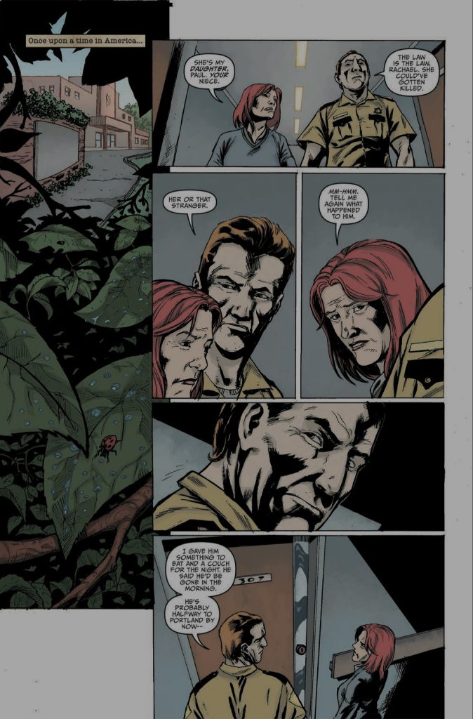
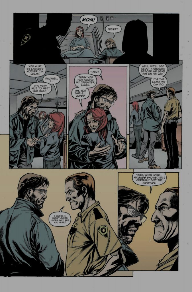
Welcome to Atlantis, Oregon, a quiet little town where Sheriff Paul Jensen knows everyone & everything that happens. When Lucas Lewis shows up after pulling Lauren, the Sheriff’s niece, out of a car wreck, things start coming to light. As Lucas asks questions that the Sheriff clearly doesn’t want to answer, certain things start coming to light. Atlantis is only as peaceful as a deal made with a group of decidedly not sparkly, but very tenacious citizens allow it to be. No one really likes questions, because everyone has secrets that they have to protect. Who is Lucas and is he really just walking from Massachusetts to Seattle to meet his dad? What bargain did Sheriff Jensen make to keep the people of Atlantis safe & happy?
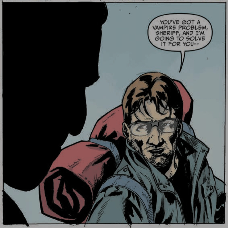
Just who is the leader of the pack who made that particular deal, and how deeply do their ties to the town go?
If you’re looking to read issue 2 of Atlantis Wasn’t Built for Tourists, you had to have read issue 1. If you haven’t, you’re gonna want to pop over to Scout’s webpage to fix that before you read too much farther. While I do try to keep these reviews as spoiler free as possible, some bits are just going to come out. For instance, we learned in the debut issue that Lucas isn’t entirely human. We don’t know what he is, really, but we do know that the presence of vampires doesn’t really surprise or worry him. We also found out that Sheriff Jensen isn’t very keen on having strangers wandering around, poking into the dark corners of his town. Finally, we learned that keeping riffraff off the streets of Atlantis is every bit as easy as ringing a bell. Like, for instance, a dinner bell.
Going into issue 2, writer Eric Palicki (have you read No Angel yet?) leads readers down another twisty turny alley where he kicks over a few more piles to reveal still more questions. The only problem with the story Palicki is telling is that it’s really hard to characterize by traditional genre. Sure, there are a whole helluva lot of elements that would fit into horror, but there are equally as many concepts which would be at home in a traditional action tale. What might just be my favorite aspect of AWBFT (sorry, that title is just a little cumbersome to have to type out over and over), with its drifter-enters-quiet-happy-remote-town-to-discover-that-it-isn’t-what-it-seems-to-be trope, is the huge nod to some of the more schlocky action movies of my teen years (High Plains Drifter, Billy Jack, Breaker Breaker, et al). And my twenties. Possibly my thirties, and maybe last week Tuesday.
Don’t tell my wife I still watch that stuff.
Palicki is crafting a dark, humorous, twisted story of secrets & lies. It’s about the hidden cost of living the American Dream, the idea that no matter how good things seem to be, someone had to pay. AWBFT is also about familial obligations, debts that run much deeper than quid pro quo. Palicki has packed all of that into his story, and he’s doing it piece by piece. He doesn’t just come out and tell readers what’s going on, rather sewing snippets of information here and there throughout the issue. If readers are following along with the conversations on the page, there should be questions forming in their minds that lead up to a muttered “sonovabitch” at the issue’s reveal.
A reveal which, by the way, kicks up a few more questions.
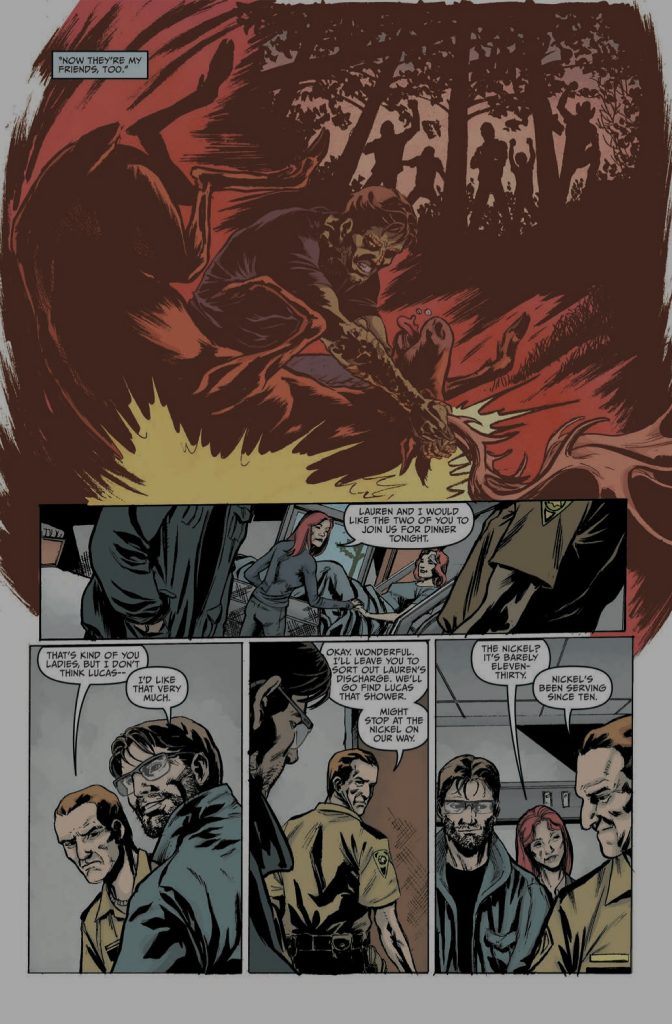
This world of hidden truths and dark corners of the Pacific Northwest is rendered by Wendell Cavalcanti & Mark Dale. Cavalcanti sets up the bones, illustrating with a great eye to shots of cinematic noir and some slick visual foreshadowing. Dale fills it in with sharp contrasts between light and shadow, with hardly a lick of gradation between them. If a panel is well lit, for instance in the spic & span world of Atlantis proper, there’s nowhere to hide. It’s when the reader is taken into the less well-traveled places, the proverbial “world beneath the world”, that the shadows creep in to provide plenty of hidden places for the predators to work their craft. This is a story in which that which is unseen is every bit as important as what is, and this artistic team is carrying more than their share of the load.
In the lettering, Shawn Lee keeps it all pretty simple and straightforward… a sharp contrast to the story itself. Dialogue is placed so as not to distract or interrupt the artwork, and it flows easily across the page. I do have an appreciation for the way certain sound effects are integrated into the pictures, not just splashed across the panel like it was a TV show fight scene featuring a certain dynamic duo. Those are the touches, subtle yet creative, that highlight a few recent examples of what I would consider poor lettering. It doesn’t have to be all flourish and fancy, it just has to effectively get the story from the page to the reader.
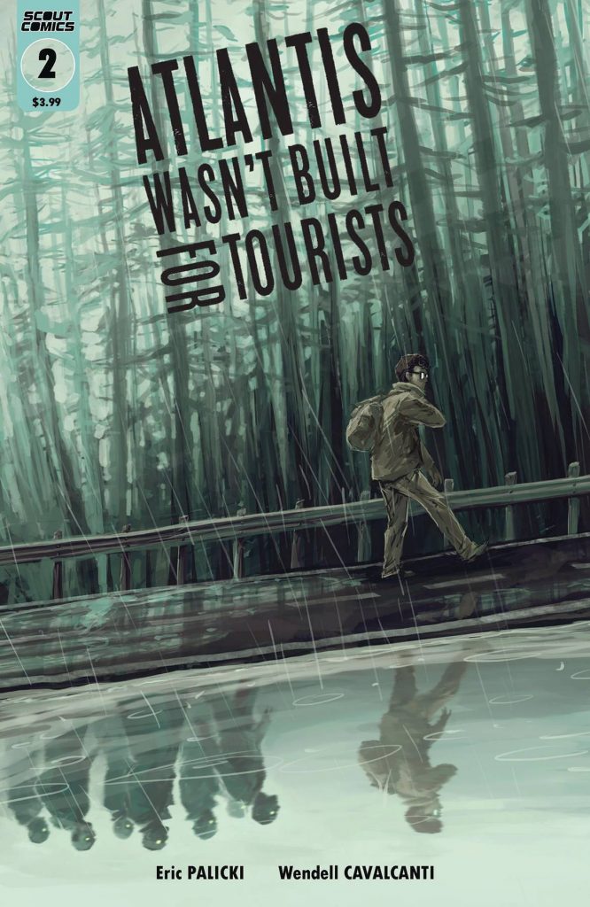
My final bit of fanboy praise goes to cover artist Caspar Wijngaard. I went back to the comic in the middle of writing this review to check some of my points, and started looking at the cover again. I don’t know that “haunting” is the right word, but there’s something about its twisted reflection that hit me. It beautifully captures the underlying theme of this title, urging readers to pay attention, to look a little closer, not to take a single page in this book for granted because there is always… ALWAYS… something happening just beneath the surface.

I’ve read through the first two issues of Atlantis Wasn’t Built for Tourists twice, the second issue three times just to make sure I wasn’t missing anything (full disclosure, I’d totally missed stuff). That’s the degree to which this isn’t a story just for casual readers… which as I type that sentence I realize how once again we’re touching on the overlying theme of this layered title from Scout Comics. Maybe I’m getting too used to how standard comic stories are told, but this is one that repeatedly snuck stuff by me. Which is fine, because it was very much worth the extra digging to drag it all out into the light.
Final Score: 12/13
