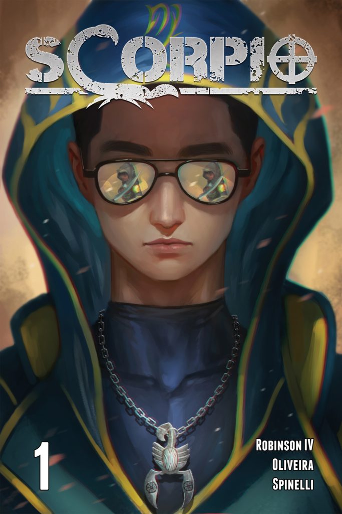
- Scorpio #1
- IV Wall Comics
- Written by John Robinson IV
- Art by Cezar Oliveira
- Colors by Viviana Spinelli
- Letters by LetterSquids
- Cover art by Nopeys
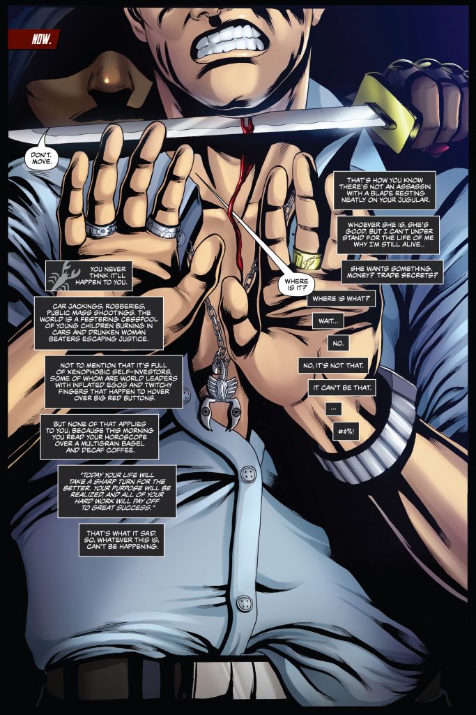
Daniel Shim is a 26 year old millionaire. He is an innovator and a pragmatist. To him, astrology, spirituality, and the supernatural are for children and the weak-minded. But the relic hidden in a dark lockbox says otherwise. What happens when he doesn’t answer his legacy? What happens when that legacy doesn’t take no for an answer?
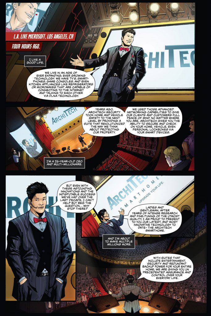
Software designer and entrepreneurial wunderkind Danny Shim has a legacy that goes beyond the inheritance of his father’s company, ArchiTech Security. As he’s about to roll out his latest life-changing product, there’s no doubt that he’s riding the wave of success and has no end in sight. He’s got a great relationship with awesome girlfriend Sofia, loyal staff who believe that he can do no wrong in the business sense, and a gorgeous mistress who is eager to… okay, moving on.
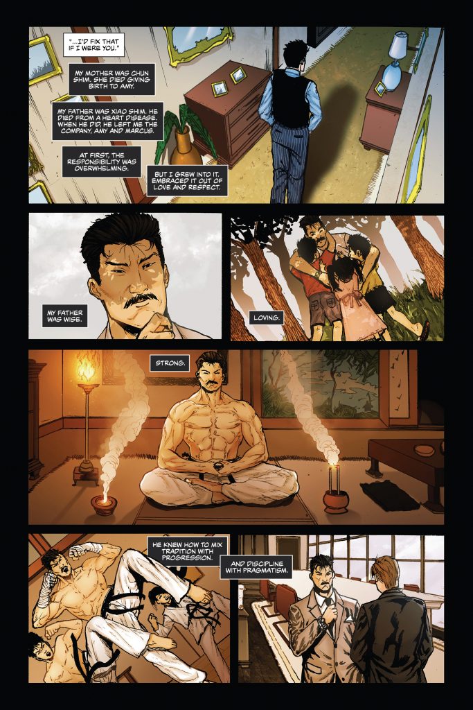
Danny’s family is a little less cooperative when it comes to acknowledging his place on top of the world. Marcus, the brother who would be second in line to run the family business, is a follower of the philosophy of YOLO (says so right there on his t-shirt). His youngest sibling Amy is more serious-minded, more grounded, even as she follows their deceased father’s more fanciful path. All very different people, it’s clear that the Shim kids are doing their best to hold onto their lives in the wake of their parents’ deaths, despite the different directions they appear to be going.
So of course, when the inevitable conflict comes, they’ll be in position to come together, united as a family and greater than the sum of their parts.
Scorpio is off to a solid start as an action title, with hints of potential intrigue scattered about here and there. We’re told that Danny’s father, Xiao Shim, was obsessed with the zodiac and insisted that everyone should work to live in harmony with their sign. We also know that this belief was tightly bound up in the trappings of the supernatural, and that Danny forcefully rejected his place in that world. Finally, we’re shown that there are other interested parties who want what Xiao had left behind for his son. When these threads come to a head and the action starts, this opening issue starts to really pick up a bit of steam.
I hope that writer John Robinson IV is able to fill in some of the blanks left hanging out there in the quieter moments of the story. As the series progresses, it’d be great to step out of Daniel’s head a bit more, to see a little farther into the world around him. For now, I get that Daniel is at center stage, and it’s understandable that we should be introduced to the world through his perspective. Moving forward, if Robinson could reveal Danny’s character more through his interactions with the people around him, fleshing out some of those peripheral characters a bit, he might be able to rely a little less on Danny’s inner monologue. Again, this is the first issue, and overall there’s a decent balance between the need to lay out what’s happened quickly, and the necessity to get things moving. My personal preference in storytelling tends to lean more heavily on the idea of a slower reveal, letting the characters and the world they live in show themselves as opposed to reliance on exposition and inner monologue.
And let me tell ya, there’s a lot to see in this introductory issue. Looking at the artwork, one thing that I thought was interesting was that Cezar Oliveira seems to be more comfortable, more fluid, as he maps out the action sequences than he does when people are just standing around talking. In the quiet moments, some of the figures look a little stiff on the page. Then when things kick into gear, the fighting has a good flow to it. Everything moves smoothly and it’s apparent that Oliveira has a solid handle on the choreography- sister Amy’s entrance in particular, is especially badass.
Rounding out the visual aspect of Scorpio, Viviana Spinelli brings colors in a fairly classic style for the comicbook medium. As Oliveira uses smaller, rapid fire panels to represent the frenetic action of a fight, Spinelli isn’t always given a lot of room in which to work, so she relies on a varied color palette to break up the backgrounds. And I believe it’s in her work that the action is brought to life, as the blurring effects show martial artists in motion and at the top of their game. I do wish I had more to say about LetterSquids, if for no other reason than that it’s a really cool name to say over and over in a paragraph. The lettering in Scorpio does its job, which is the end goal for a good letterer… although I gotta give out some kudos for nailing the fonts on dope-smoking Marcus’s posters. The guy may be a shiftless lay about, but he’s got good taste in movies.
The first issue of Scorpio has a lot of promise for an action series. Sure, there may be gaps here and there, but hopefully that’s all by design. Readers are always able to get more invested in a story that lets them learn about the characters and their world as they go. As it stands, there’s already enough here to let this title stand out from the crowd a bit. For an indie comic, the toughest step is getting into readers’ hands, so head over to www.scorpiocomic.com and give them a look. Get in on the ground floor and show these creators some love.
Final Score: 8


